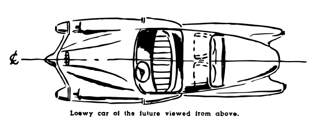
Pop Art emerged in Britain and America during the mid-1950s and early 1960s as a direct challenge to fine art’s gatekeeping apparatus. The Pop Art design culture argument was not that soup cans and comic strips were beautiful. It was that the line between “high” and “low” was a performance of class, not an aesthetic judgment.
Why Pop Art design culture was a class argument, not an aesthetic one
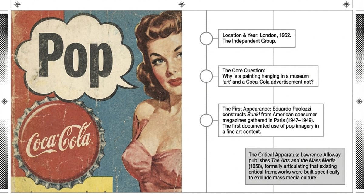
The Independent Group was founded in London in 1952. Its members included sculptor Eduardo Paolozzi, critic Lawrence Alloway, architect-critic Reyner Banham, and artist Richard Hamilton. At the inaugural meeting, Paolozzi showed collages he had assembled from American consumer magazines during a 1947–1949 stay in Paris: advertisements, product packaging, comic covers, magazine pages. His work Bunk! is the first documented use of “pop” imagery in a fine art context. Paolozzi’s I Was a Rich Man’s Plaything (1947) contains the word “Pop” printed on a magazine cover, the first time the word appeared in an art object.
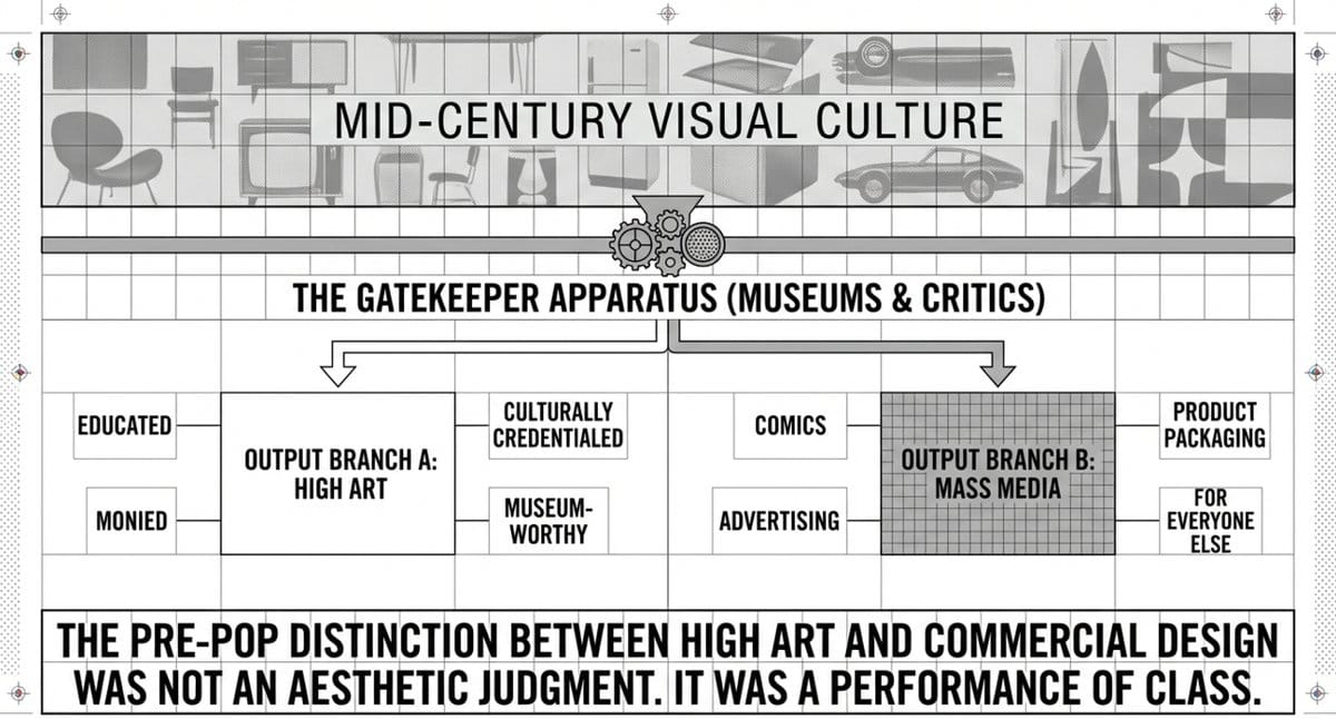
The Independent Group spent the early and mid-1950s asking a single question: why is a painting hanging in a museum “art” and a Coca-Cola advertisement not? This was not an innocent question. The distinction tracked class. High art was for the educated, the monied, the culturally credentialed. Commercial imagery was for everyone else. The gallery was a sorting mechanism. The Independent Group was challenging the sorting.
The term “pop art” emerged from these discussions around mid-1955. Credit for coining it is disputed between Lawrence Alloway and artist John McHale. In his 1958 essay “The Arts and the Mass Media” (Architectural Design, February 1958), Alloway was the first to articulate formally why this question mattered: the mass media had created a new visual culture that the existing critical apparatus had no tools to evaluate because it had been built specifically to exclude that culture. Artforum‘s critical history of the movement traces how Alloway’s framework eventually restructured institutional art criticism from the inside.
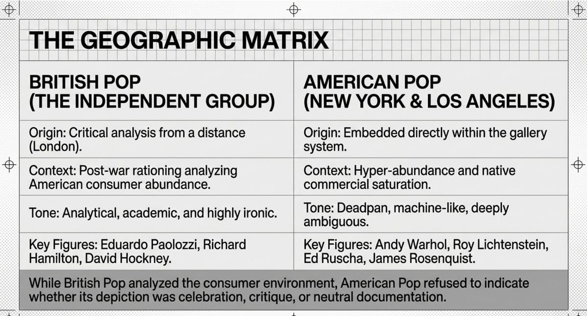
Richard Hamilton’s collage Just what is it that makes today’s homes so different, so appealing? (1956) is the British origin image. Made for the “This Is Tomorrow” exhibition at the Whitechapel Gallery in London, it assembled American consumer imagery (a bodybuilder with a Tootsie Pop, a pin-up reclining on a sofa, a television, canned ham, a vacuum cleaner) into a domestic interior. The image is 26 × 25 centimeters. A poster of it circulated far more widely than the original. Hamilton was not mocking the American consumer or celebrating American abundance. He was observing that the consumer’s visual world was as dense with meaning, desire, and anxiety as any gallery.
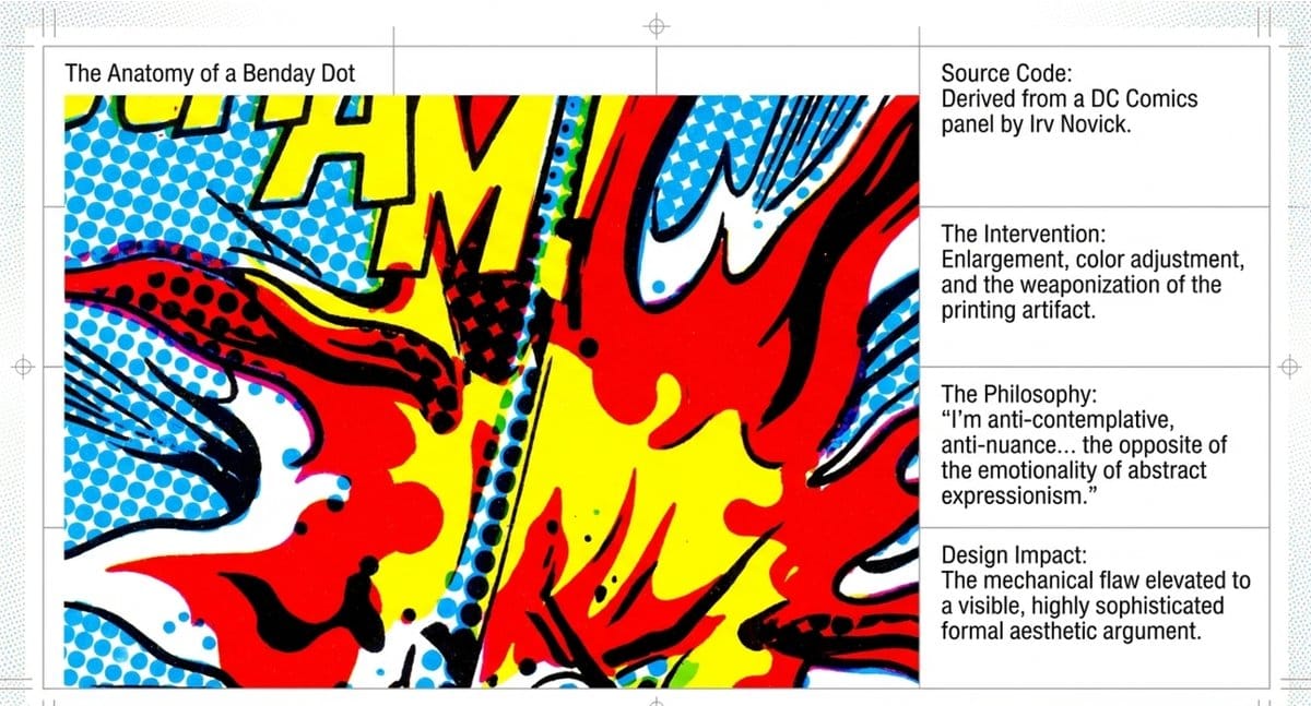
In America, by the early 1960s, the argument was made differently and more deadpan. Andy Warhol’s Campbell’s Soup Cans (1962), 32 canvases each depicting a different variety of the soup hung like a supermarket shelf at the Ferus Gallery in Los Angeles, refused to say whether the depiction was celebration, critique, or neutral documentation. Warhol said “I want to be a machine.” He meant it as a statement about his production method and about what he thought art should do, which was not to express a private sensibility but to reproduce what was already there. Roy Lichtenstein took comic-panel imagery and enlarged it, adding his characteristic Benday dots, the printing artifact made aesthetic. Lichtenstein said of his own work: “I’m anti-contemplative, anti-nuance… the opposite of the emotionality of abstract expressionism.” Ed Ruscha photographed gas stations. All of them were refusing the premise that significant subject matter was a prerequisite for significant art.
Pop Art is when design became aware of its own context
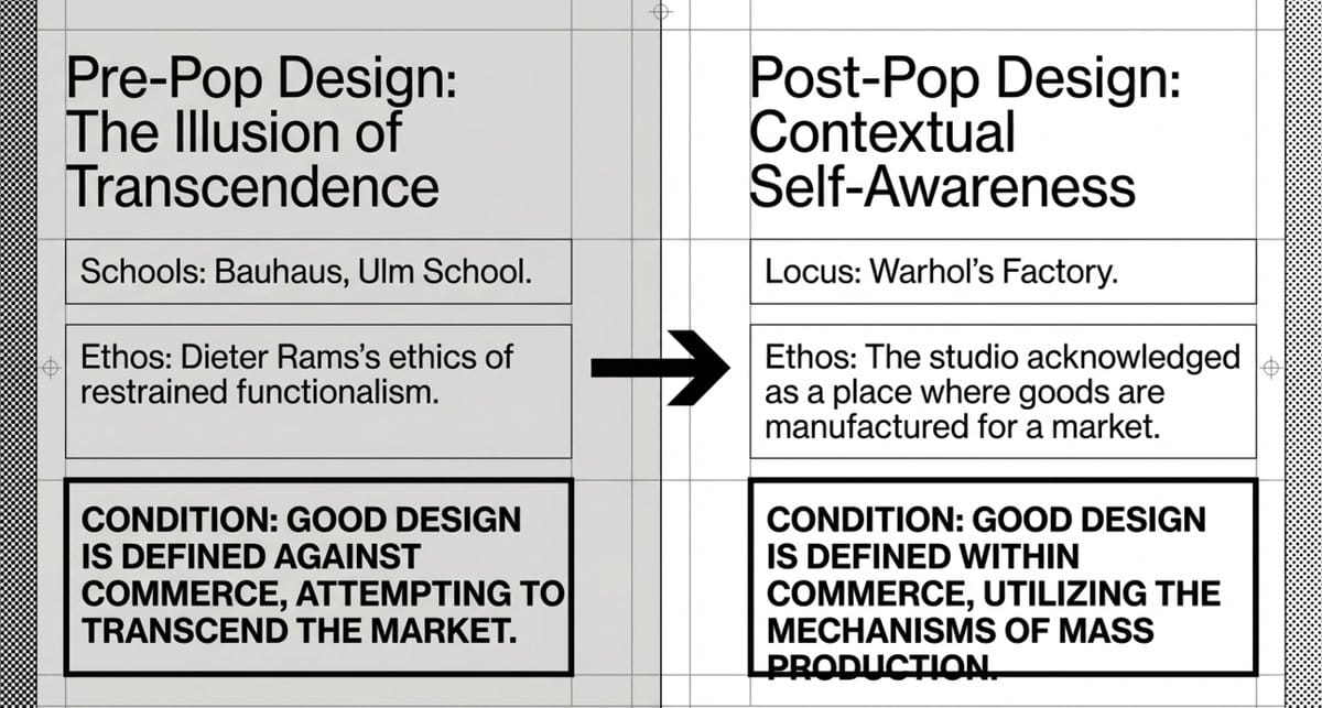
Pop Art is the moment design culture became explicitly self-aware about its commercial context. Before Pop Art, the dominant tradition in “good design” thinking held that design could transcend commerce: the Bauhaus ideal, the Ulm School model, Dieter Rams’s ethics of restrained functionalism. Good design was defined against commerce, not within it. Pop Art ended that pretense.
Warhol’s Factory, named deliberately, was a model of artistic production that acknowledged what the studio always was: a place where goods were made for a market. Warhol made art in editions, with assistants, using mechanical reproduction techniques. He asked: what if the original and the reproduction were equally valid? What if the scarcity that makes an “original” expensive is just a manufacturing decision? This question has never been answered, and it shapes every limited edition product launch, every “authenticity” claim in design, every argument between design and manufacturing that has happened since.
David Hockney’s early work was explicitly Pop, but his longer contribution is different: he made the lifestyle subject legitimate. The swimming pools of his California paintings (A Bigger Splash, 1967, Tate) treated affluent comfort not as a moral failure but as a visual problem worth solving. This opened the door to what became the whole field of lifestyle design, the idea that designed objects could be personal expression, class signal, and aesthetic choice simultaneously, without apology.
Ed Ruscha’s contribution to design culture is more specific and less discussed. His gas stations (Twenty-Six Gasoline Stations, 1963), his word paintings (OOF, SMASH, NOISE), his Every Building on the Sunset Strip (1966): all treat the everyday built environment as worthy of the same sustained visual attention as European painting. This is the vernacular design sensibility, the proposition that design culture lives in the ordinary, not in the exceptional. Every designer who photographs street signs, commercial packaging, or utilitarian architecture is working in Ruscha’s tradition, whether they know it or not. Frieze‘s account of Ruscha’s influence documents how his photographic books became a direct model for designers working with vernacular visual culture in the 1970s and 1980s.
The works that made the argument visible
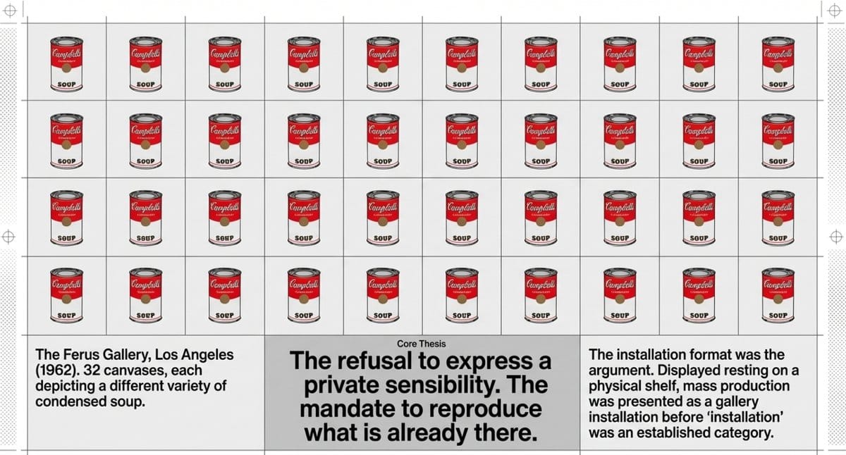
Campbell’s Soup Cans, Andy Warhol (1962): 32 canvases, each depicting a different variety of Campbell’s condensed soup, hung at the Ferus Gallery in Los Angeles in a row like a supermarket shelf. The installation format was the argument: mass production displayed as gallery installation, before “installation” was a category. Now at MoMA.
Whaam!, Roy Lichtenstein (1963): A two-panel painting four meters wide, derived from a DC Comics panel originally drawn by Irv Novick for All-American Men of War. Lichtenstein enlarged the source, adjusted the colors, and made the Benday dot pattern, the offset printing artifact, into a visible aesthetic element. Tate Modern.
Just what is it that makes today’s homes so different, so appealing?, Richard Hamilton (1956): A 26 × 25 centimeter collage that launched the British Pop Art conversation. Every element came from American magazines. The domestic space as a site of consumer desire, anxiety, and aspiration. Kunsthalle Tübingen. The poster was more widely distributed than the original during the 1950s and 1960s.
F-111, James Rosenquist (1964–1965): A 26-meter-wide mural wrapping four walls of the Leo Castelli Gallery. A US Air Force F-111 jet fighter runs the length of the image; interspersed with it are an atomic mushroom cloud, a girl under a hair dryer, canned spaghetti, lightbulbs, a beach umbrella, car tires. The scale makes consumer culture and military technology literally immersive. MoMA acquired it in 1996. Art in America‘s analysis of F-111 traces how Rosenquist’s mural-scale strategy forced the gallery space itself into the political argument in ways that Warhol’s deadpan never attempted.
Shop the Collection
Warhol’s own voice is more useful for understanding Pop Art than most critical accounts of it.
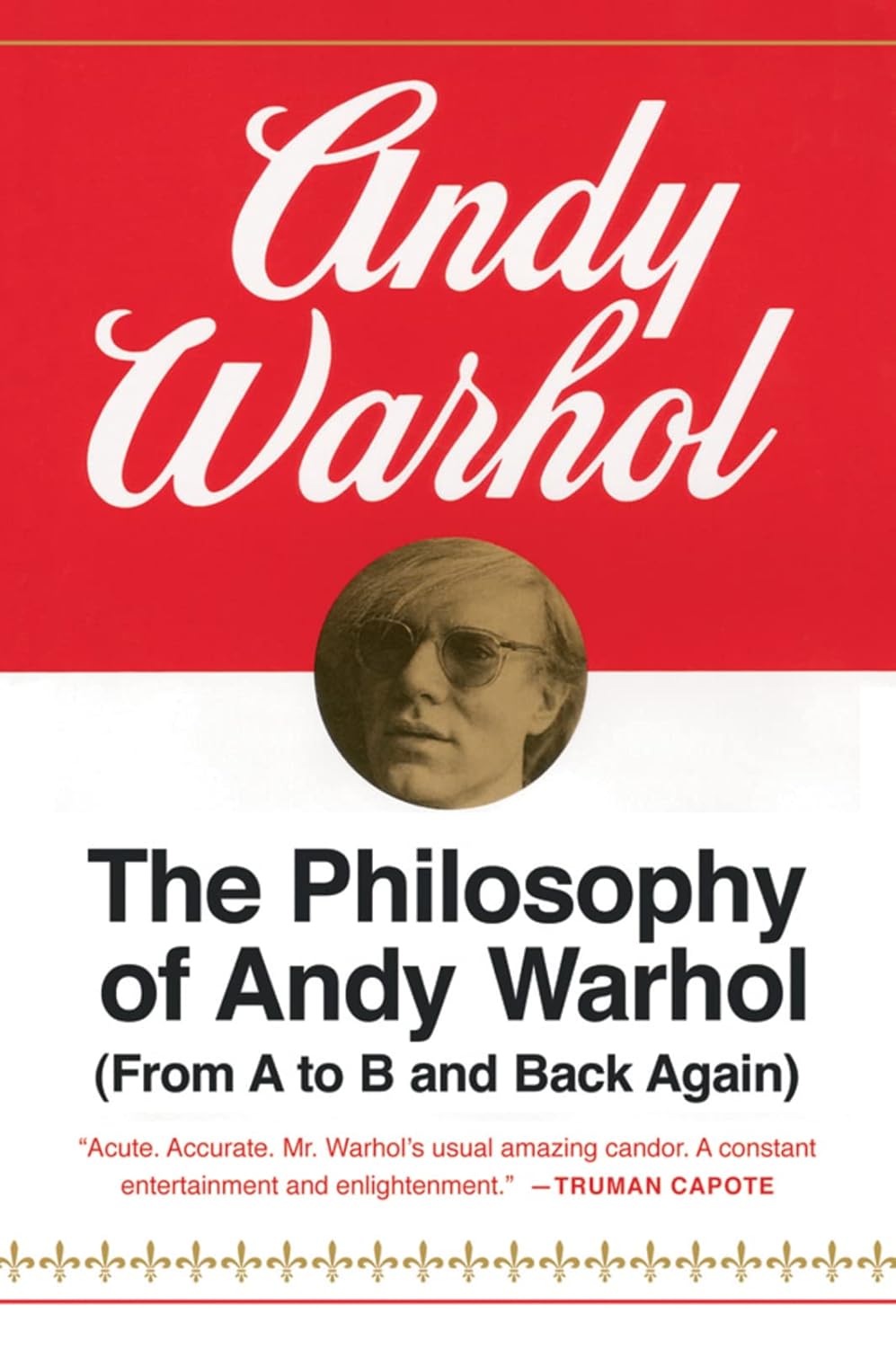
- Andy Warhol, The Philosophy of Andy Warhol (From A to B and Back Again) (Harcourt, 1975): Not a manifesto. A collection of observations about money, fame, food, beauty, and commerce that are more revealing about what Pop Art was doing than anything written about it from the outside. Essential primary source.
- Eric Shanes, Pop Art (Parkstone Press, 2014): A solid single-volume survey covering British and American Pop Art with strong reproduction quality. Covers Hamilton, Paolozzi, and the Independent Group alongside Warhol, Lichtenstein, and Ruscha.
Further Reading
Two books cover the argument rather than just the imagery.
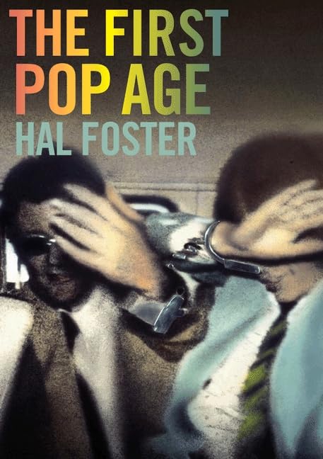
- Hal Foster, The First Pop Age: Painting and Subjectivity in the Art of Hamilton, Lichtenstein, Warhol, Richter, and Ruscha (Princeton University Press, 2011): The most rigorous critical account of Pop Art’s formal achievement. Foster treats the movement as philosophically serious and gives Hamilton and Ruscha the attention they deserve alongside Warhol and Lichtenstein.
- Janis Hendrickson, Roy Lichtenstein (Taschen, Basic Art Series): Lichtenstein is regularly overshadowed by Warhol in survey accounts. Hendrickson’s focused study establishes why Lichtenstein’s specific project (the Benday dot, the comic panel, the mechanical reproduction of hand-made marks) is the most technically sophisticated formal argument in American Pop Art.
Frequently Asked Questions
What was Pop Art arguing about high and low culture?
Pop Art’s central argument was that the distinction between “high art” (painting, sculpture, museum-worthy) and “low culture” (advertising, comics, product packaging) was not an aesthetic judgment but a class performance. High art was for the educated and affluent; commercial imagery was for everyone else. Pop Art challenged the institutional machinery (galleries, critics, museums) that enforced this distinction by using commercial imagery as the explicit subject matter of fine art.
Where did Pop Art start?
Pop Art developed simultaneously but differently in Britain and America. The British precursor was the Independent Group, founded in London in 1952, whose members first articulated why popular culture deserved serious critical attention. The term “pop art” emerged from Independent Group discussions around 1955. American Pop Art, which is now the better-known chapter, developed from the late 1950s onward in New York, with Warhol, Lichtenstein, Rosenquist, and Ruscha as the central figures.
Who were the main Pop Art artists?
The main British Pop artists include Eduardo Paolozzi, Richard Hamilton, and David Hockney. The main American Pop artists include Andy Warhol, Roy Lichtenstein, James Rosenquist, Ed Ruscha, and Tom Wesselmann. Jasper Johns and Robert Rauschenberg are often cited as proto-Pop figures who bridged Abstract Expressionism and Pop in the late 1950s. Pop Art’s influence on subsequent generations can be traced through artists like Jean-Michel Basquiat, whose street-sourced imagery extended Pop’s challenge to gallery hierarchies into the 1980s; Yayoi Kusama, whose repetitive dot language drew from Pop’s visual logic while adding a psychological dimension; and Kara Walker, whose large-scale silhouette installations use Pop’s appetite for borrowed imagery to reframe the iconography of American historical violence.
What is the difference between British and American Pop Art?
British Pop Art emerged from critical analysis of American consumer culture viewed from a distance. Hamilton and Paolozzi were working with American magazines in a country that didn’t yet have American levels of consumer abundance. The British work tends to be more analytical and ironic. American Pop Art is more deadpan: Warhol in particular refused to indicate whether his soup cans were celebration, critique, or neutral documentation. The ambiguity was the point.
Why is Pop Art important for design?
Pop Art is the moment design culture became self-aware about its commercial context. Before Pop Art, the dominant tradition in serious design thinking held that good design transcended commerce. Pop Art argued that the commercial context is not something to overcome: it is the material. Warhol’s Factory model (art made in editions, with assistants, using mechanical reproduction) challenged every assumption about artistic authenticity and scarcity that the design world has been negotiating ever since.
Is Pop Art considered fine art?
Yes. Pop Art has been fully absorbed into the fine art canon. Warhol, Lichtenstein, and Hamilton are represented in every major museum. The argument Pop Art made, that commercial imagery and fine art occupy the same cultural space, succeeded so completely that it is now unremarkable. The question it raised has not been resolved. It has simply become a permanent condition of contemporary visual culture.
Pop Art sits within the broader history of art movements covered on this site. See Abstract Expressionism — the movement Pop Art defined itself against — and Design Legends for the full context of how visual culture shifted through the twentieth century. For books covering Pop Art and the broader arc of contemporary art, see our guide to best art books.
See also: West Coast Conceptual Art, Conceptual Art After Minimalism
About Joe Post
Joe Post holds an MFA in Art from California Institute of the Arts (CalArts) and has done additional graduate work at the School of the Art Institute of Chicago. He founded Art Design Ideas to write about design as cultural argument — the decisions, contradictions, and assumptions built into the objects we live with.