Anoka Faruqee is a Bangladeshi-American painter whose moiré works generate interference patterns through layered color systems, producing optical effects that shift as the viewer moves. A professor at Yale School of Art, Faruqee treats perception itself as the medium — her paintings do not depict visual phenomena, they enact them.
What Faruqee Was Arguing That Op Art Never Quite Said
The starting point for understanding Anoka Faruqee’s paintings is a MoMA exhibition from 1965. The Responsive Eye, curated by William Seitz, presented perceptual abstraction as its own legitimate mode, proof that paintings could act directly on the eye rather than representing something for the eye to decipher. The show was packed. It was also widely dismissed as novelty. Critics treated the optical effects as a parlor trick, something that happened to you rather than something you participated in. That distinction mattered, and it was wrong.
Faruqee’s work arrives after Minimalism and Conceptualism have changed the terms of the argument. She is not trying to revive Op Art. She is making a different case: not that the eye can be tricked, but that all seeing is active construction. There is no passive reception. The viewer completes the work.
That claim has a philosophical lineage. Rudolf Arnheim, in Visual Thinking (University of California Press, 1969), argued against the Cartesian separation of perception from thought. His position was that visual perception is not a pre-rational stage before “real” cognition — it is cognition. “All thinking is basically perceptual in nature,” he wrote. Faruqee does not name Arnheim as an influence in any published interview. But her practice enacts his thesis more completely than almost any painter working today. The argument he made in prose, she makes in paint.
The tradition of American postwar abstraction is the water Faruqee swims in, and arguing against: Faruqee’s perceptual project is both indebted to and in dispute with the history of American abstract painting, which had its own complex relationship to what a canvas could ask of a viewer.
Her source material makes this more specific. Faruqee’s parents immigrated from Bangladesh, and she has spoken directly about Islamic tile geometry, rugs, and textiles as structural problems she works through, not as decorative references but as questions about how pattern and field create or dissolve figure and ground (BOMB Magazine, David Humphrey interview, 2013). The geometric vocabulary she draws from already carries a tradition of high formal precision in which pattern is knowledge, not ornament.
Like Yayoi Kusama, whose obsessive repetition also works to produce perceptual disorientation through accumulated pattern, Faruqee uses the grid as a thinking instrument. But where Kusama’s field is explicitly psychological (the self dissolved into infinity), Faruqee’s field is about something more structural: the mechanics of how the eye builds what it sees.
A Painting That Doesn’t Hold Still
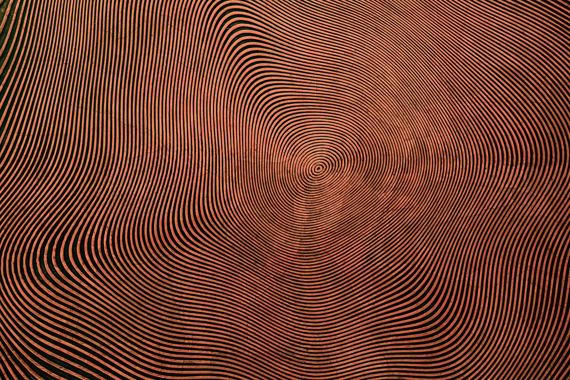
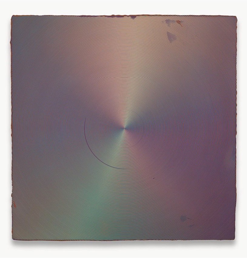
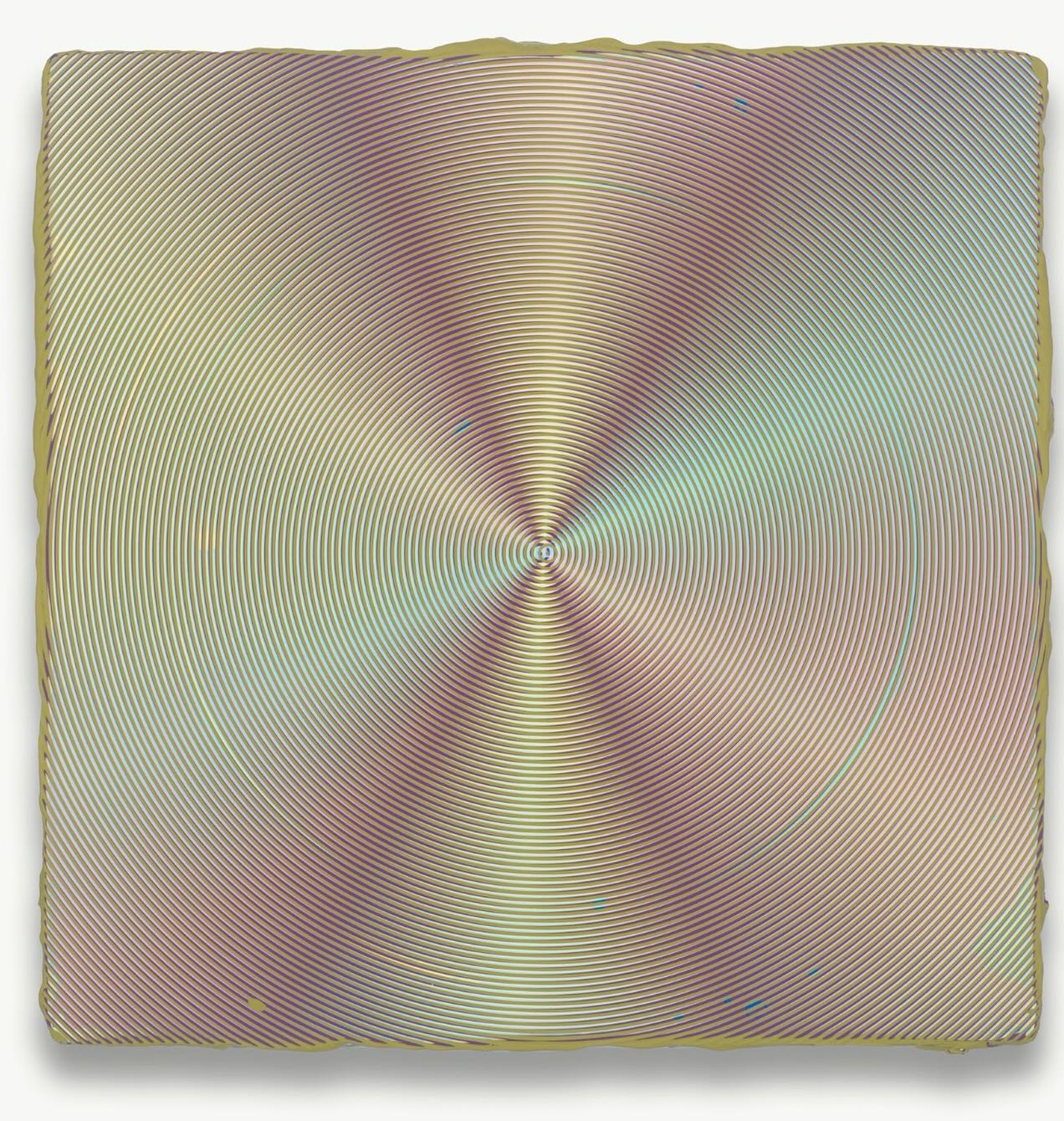
Here is what John Yau described when he stood in front of one of Faruqee’s moiré paintings at Koenig and Clinton in 2017, reviewing the show Rainbows and Bruises for Hyperallergic: “When you are close-up, you see the ridged concentric lines and how much they overlap.” Move back, and something changes. “Your eyes begin mixing the colors, and you see yellow or violet, hues and spectral tones that she has not used.”
That sentence is worth staying with. The yellow she did not put on the canvas. The violet that appears only when you move to the correct distance. The painting generates color, color that does not physically exist on the surface, through the movement of the viewer. You are not looking at a finished object. You are completing a system.
The mechanism behind this is specific. Beginning in 2012, Faruqee began collaborating with David Driscoll to develop large laser-cut stainless-steel combs with various teeth and notches, devised as a painting tool. Driscoll (born 1964, Steubenville, Ohio; BFA Ohio State University, 1987) devised these instruments as a fabrication partnership that became a full studio practice. The combs rake wet paint in layered concentric or near-concentric motions. Color mixing happens optically, not on the palette. Faruqee has described the experience as “sublimating the materiality for the optical experience” (BOMB, 2013).
The 2024 artists’ statement she and Driscoll published describes the theoretical frame directly: “Precision and plotting paradoxically yield resonant and unstable perceptual experiences. Using principles of phasing, binary logic, and wave propagation, these elusive paintings organize pigment and geometry while intimating their material origins.” And: “these abstract works re-enact, rather than translate, inherent structures within nature, specifically light as wavelength.”
That word, re-enact, is the crux. These are not paintings about interference. They are interference, produced through physical means that have the same logic as the phenomenon they generate. This is how color functions in Faruqee’s work — not as Rothko’s color field acting on the viewer through scale and saturation, but as a field the viewer’s own movement produces. Rothko’s paintings ask you to be still. Faruqee’s require you to move.
The Josef Albers connection is not incidental. Faruqee organized the 2015 symposium “Search Versus Re-Search: Josef Albers, Artist and Educator” at Yale, directed a 33-minute documentary of the same title, and contributed commentary to the Interaction of Color iPad application. The Yale School of Art color tradition (Albers’s system of adjacency, the argument that color has no fixed properties but only relational ones) runs directly through her practice. She is working inside that tradition and pushing past it: where Albers documented the behavior of color in two-dimensional proximity, Faruqee adds the viewer’s movement in three-dimensional space as the variable that changes everything.
David Humphrey, writing about her work in BOMB in 2013, put it this way: the paintings are “emphatically material” yet produce a “disappearance of matter into the visual hum” — “specific, individuated, and maybe even eccentric, without being particularly subjective.” That absence of the subjective is deliberate. The point that painting is color’s laboratory, with pattern one of its most powerful investigative tools, is precisely right: Faruqee’s studio is a laboratory in the sense that a laboratory is a place where controlled conditions produce findings. The findings happen in the viewer’s eyes.
Five Paintings and What They Do to the Room
The Fade series (2001–2012) came first, and it clarifies what Faruqee was already thinking before she had the moiré tools. Working alone, she mixed hundreds of subtly shifting colors and applied them one handmade “pixel” at a time, using asterisk and tripod forms derived from Islamic tile geometry, painted freehand without rulers or grids. At a reading distance, the Fade works look like smooth digital gradients, luminous, almost printed. Up close, they are built from individual marks. The tension between apparent precision and actual hand is the subject. You are looking at craft that has disguised itself as technology. The disguise is the point.
The Moiré Paintings (2013–2017)
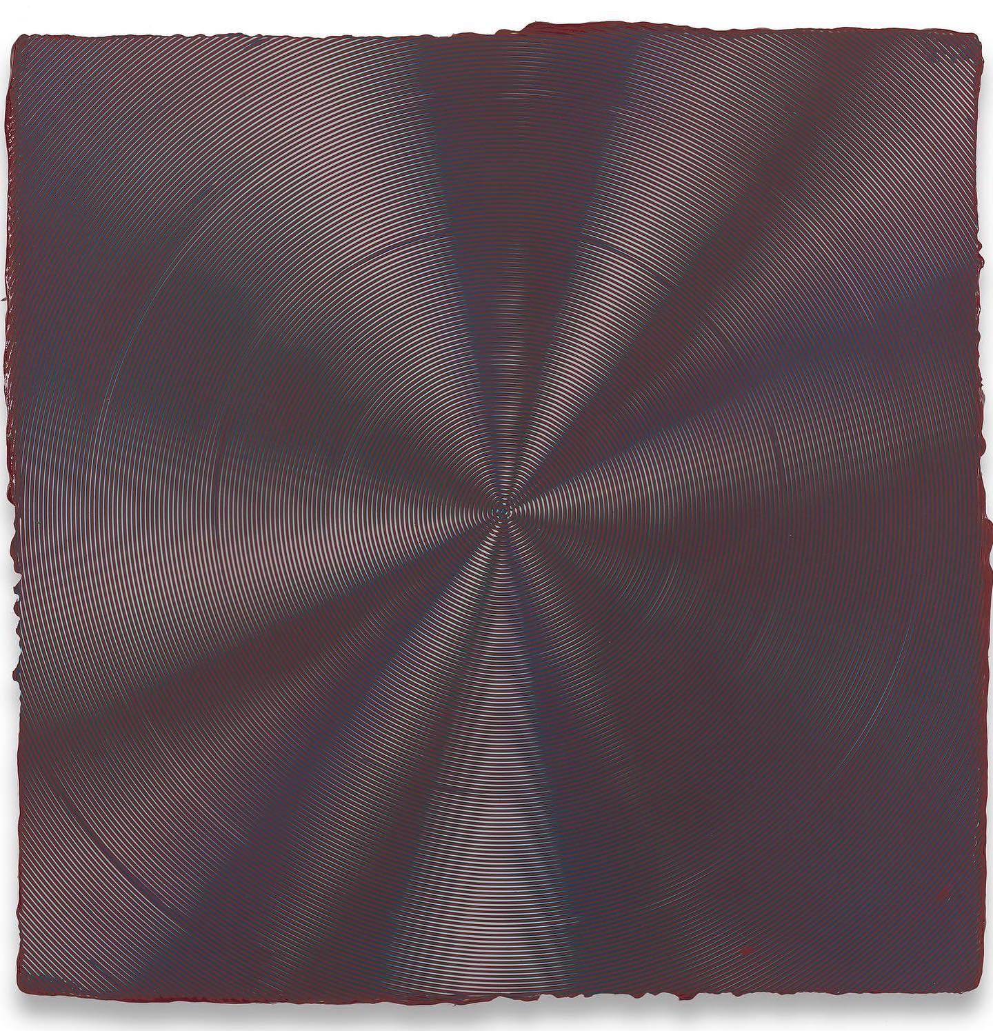
When Driscoll devised the laser-cut comb tools in 2012, the collaboration began, and the Fade logic became structural rather than cumulative. The moiré paintings (cataloged in the studio as 2013P-06, 2014P-21, and onward) were first presented at Hosfelt Gallery in San Francisco in 2013, in the exhibition Substance and Accident. The reference in that title is scholastic: substance as what a thing essentially is, accident as what it contingently appears to be. The paintings pose exactly that question. The color you see is an accident, produced by your position, changeable by movement. The substance is the layered paint, the comb tracks, the geometry of interference. None of that is what you experience.
The Museum of Modern Art‘s holdings in perceptual abstraction provide the institutional backdrop for understanding where Faruqee’s moiré series fits in the longer argument, from Bridget Riley and Victor Vasarely through Faruqee’s more philosophically loaded practice.
The Visible Spectrum (Secession, Vienna, 2017)
The Secession exhibition was Faruqee’s first institutional solo in Europe. It presented both the Moiré Paintings and the Wave Paintings together. The Wave Paintings use the same comb-tool method but generate sinusoidal color fields rather than concentric interference patterns. Together, the two series read as a complete statement about light as wavelength: diffraction, reflection, refraction, interference, the full physics of how light behaves, translated into paint through tools and process rather than simulation.
Circle Paintings (2019–2024) and Dark Rainbow
The most recent body of work extends the moiré logic into a circular field and was shown most recently as Dark Rainbow at Hosfelt Gallery, San Francisco, in 2024. Yau, reviewing the precursor show, described the addition of white alongside red, blue, and green as producing “a more ephemeral condition, in which the spectral light and colors change with each move you make in front of the painting.” The circle changes the terms: the concentric logic of interference is now the literal shape of the work, not just its effect.
CMY RGB XYZ (2008)
The solo exhibition at Hosfelt Gallery, New York, in 2008 announced the vocabulary Faruqee would push further in the following decade; it predated the collaborative moiré work by four years. The title names three color systems: CMYK (subtractive, the printer’s model), RGB (additive, the screen’s model), XYZ (the CIE color space used in scientific measurement). She was already thinking about painting as a site where these systems meet and conflict. The moiré work is the fulfillment of that inquiry.
Shop the Collection
Two books worth owning, not because they are about Faruqee, but because they are the theoretical ground her work stands on.
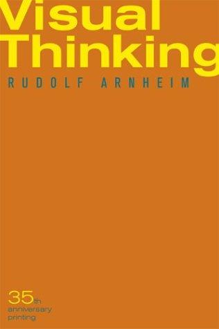
Rudolf Arnheim, Visual Thinking (University of California Press, 1969/2004): Arnheim’s central argument, that seeing is not a pre-cognitive act but is itself a form of reasoning, is the philosophical claim that Faruqee’s paintings make visible. If you want to understand why these works ask something different of the eye than Op Art did, start here.
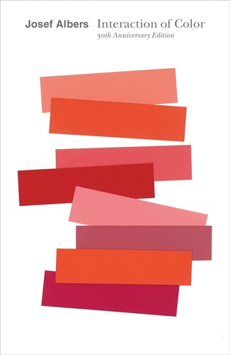
Josef Albers, Interaction of Color (50th Anniversary Edition, Yale University Press): Faruqee organized a Yale symposium on Albers, directed a documentary about his teaching, and annotated the Interaction of Color iPad app. This book is the most rigorous existing guide to how color behaves when adjacent to itself, exactly what the moiré paintings are studying. Owning it changes how you look at her work.
Further Reading
These two books are the ones to own if you want to place Faruqee’s practice in the field from which it emerged and the perceptual tradition it builds on. The ADI art books list has additional depth on the theoretical literature.
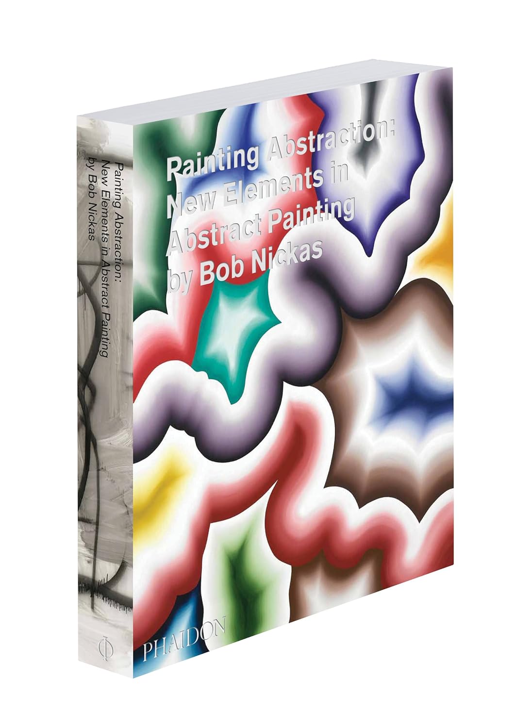
Bob Nickas, Painting Abstraction: New Elements in Abstract Painting (Phaidon, 2009): Nickas profiles eighty contemporary abstract painters across the full range of positions being staked out when Faruqee’s moiré series began, useful for understanding where her project sits in a crowded field, and what it is arguing against.
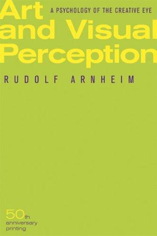
Rudolf Arnheim, Art and Visual Perception: A Psychology of the Creative Eye (University of California Press, 2nd ed., 1974): The longer companion to Visual Thinking, more detailed on specific perceptual phenomena including movement, tension, and color as perceptual event rather than physical property. The chapter on movement explains, more precisely than most criticism has managed, why Faruqee’s paintings appear to animate.
Frequently Asked Questions
What are Anoka Faruqee’s paintings made of?
Faruqee’s moiré paintings are oil on linen or canvas, built through multiple wet layers of paint applied using large laser-cut stainless-steel combs with varied teeth and notches, tools devised by her collaborator David Driscoll. The combs rake through wet paint in layered concentric motions, creating interference patterns through the physical overlap of color. Earlier Fade series works were built from hundreds of individually applied marks using asterisk and tripod forms painted freehand.
How does the moiré effect work in painting?
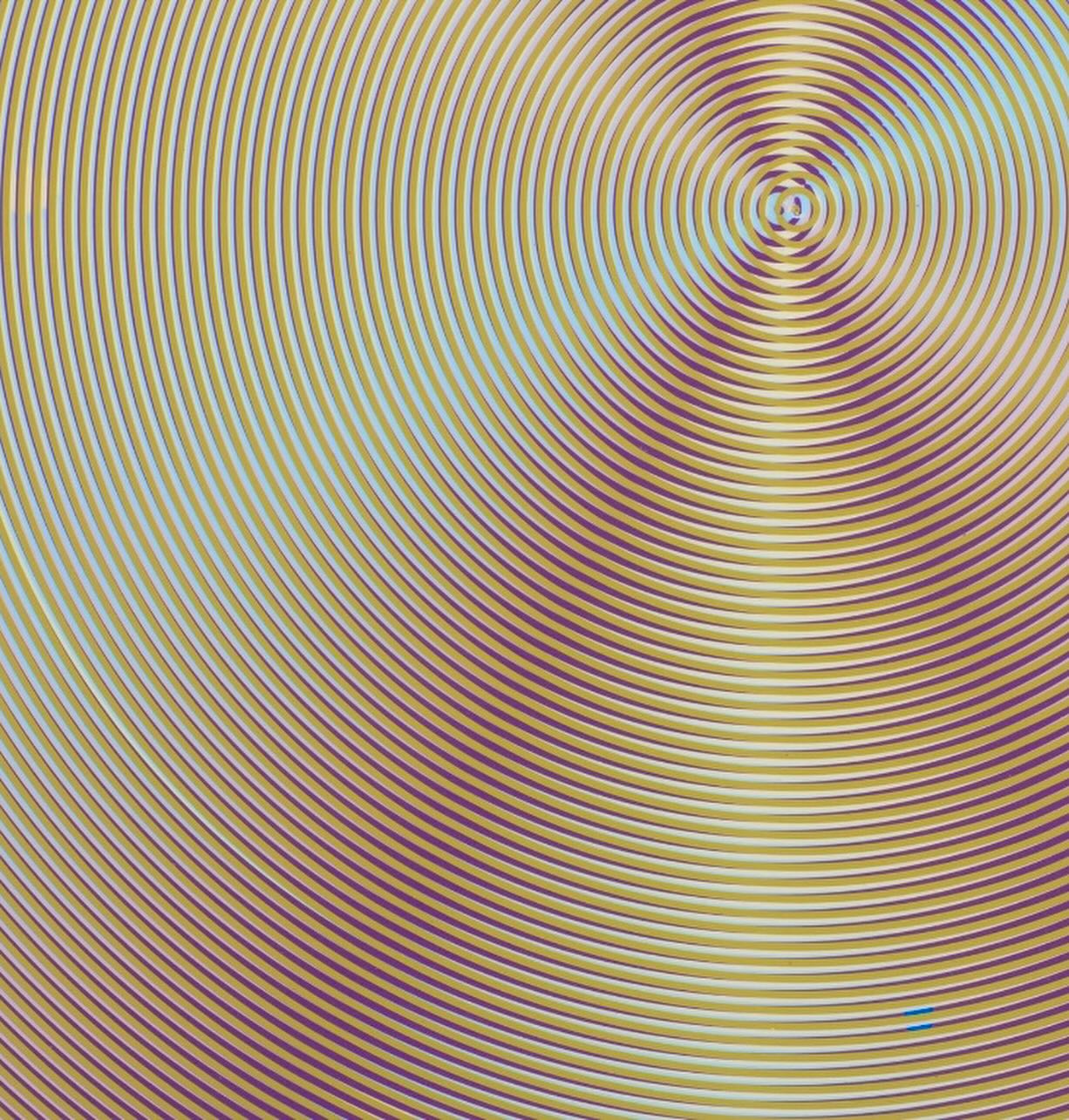
A moiré pattern arises when two sets of lines or curves are overlaid at a slight offset or different frequencies, and the visual interference between them creates a third pattern that exists in neither set alone. In Faruqee and Driscoll’s paintings, this is produced physically: comb-raked layers of paint overlap at slight variations in direction or spacing. The result is that the painting appears to contain colors that were never applied to the surface, hues generated by the eye mixing adjacent frequencies at certain viewing distances.
Why do Faruqee’s paintings appear to move?
Because the image changes depending on where you stand. At close range, the viewer sees the actual ridged concentric paint tracks and their overlaps. At greater distance, the eye begins mixing adjacent colors optically, generating new hues and causing the surface to appear to pulse or shift. The movement is not in the painting; it is produced by the viewer’s position relative to it. John Yau (Hyperallergic, 2017) described this as seeing “hues and spectral tones that she has not used” — color that exists only in the act of looking.
Is Anoka Faruqee associated with Op Art?
Her work is downstream of the perceptual abstraction tradition that Op Art represents. The Responsive Eye at MoMA in 1965 is the institutional reference point, but her practice is more philosophically loaded than her Op Art predecessors. Op Art was largely interested in proving that the eye could be tricked. Faruqee’s argument is different: that all seeing is active construction, not passive reception. The distinction matters. Her work doesn’t exploit a visual glitch; it requires the viewer’s movement to complete itself.
Who is David Driscoll and what is his role in the collaborative work?
David Driscoll (born 1964, Steubenville, Ohio; BFA Ohio State University, 1987) is Faruqee’s collaborator since 2012. Driscoll devised the large laser-cut stainless-steel combs that are the primary tool of the moiré and wave paintings, instruments with varied teeth and notches that allow wet paint to be raked in controlled patterns. The collaboration began as a fabrication partnership and became a full studio practice. The moiré, wave, and circle series are all produced jointly under the name Faruqee/Driscoll.
Where can I see Anoka Faruqee’s paintings in person?
Faruqee is represented by Hosfelt Gallery in San Francisco and by Galería Cayón in Madrid. The most recent major exhibition, Dark Rainbow, was held at Hosfelt Gallery in 2024. Her work has been shown at the Secession in Vienna, where The Visible Spectrum was presented in 2017, and she was included in Extreme Abstraction at the Albright Knox Art Gallery in Buffalo in 2005. For current exhibition information, the studio website at faruqeedriscollstudio.com maintains an up-to-date schedule.
See also: Josef Albers on Color, Kasarian Dane, Mark Rothko
About Joe Post
Joe Post holds an MFA in Art from California Institute of the Arts (CalArts) and has done additional graduate work at the School of the Art Institute of Chicago. He founded Art Design Ideas to write about design as cultural argument — the decisions, contradictions, and assumptions built into the objects we live with.