Josef Albers was a German-American painter and educator whose color theory—codified in Interaction of Color (1963)—remains the most rigorous investigation of color perception ever committed to paint. Trained at the Bauhaus, he spent more than twenty-five years making a single image—nested squares—to prove one argument: color has no absolute identity. Every color is changed by what surrounds it.
Why Albers kept painting the same square for twenty-five years
The answer is not obsession. It is methodology. Albers joined the Bauhaus in Weimar in 1920 as a student and became faculty by 1922, the first Bauhaus student promoted to teacher. That structural position mattered. At the most contested art school of the twentieth century, he learned that perception could not simply be asserted. It had to be demonstrated. You either showed the effect or you did not have an argument.
The Bauhaus closed under Nazi pressure in 1933. Albers and his wife Anni emigrated to the United States, where they organized the fine arts curriculum at Black Mountain College in North Carolina, a school that had no buildings when they arrived in 1933. The conditions were stripped down. Albers arrived with a pedagogy and almost no materials and had to build both a curriculum and a physical infrastructure from nothing. That experience of making an argument when the institutional scaffolding has been taken away is part of what sharpens the series he would eventually begin.
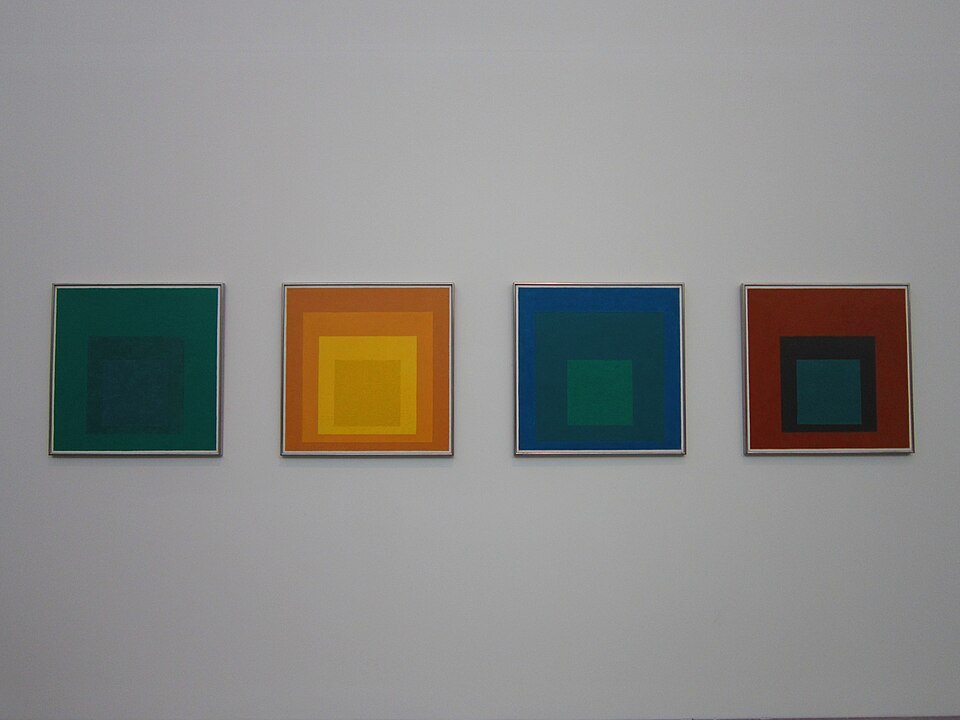
In 1950, Yale University appointed him chair of the Department of Design. That same year, Albers began Homage to the Square. The format was fixed from the start: four nested concentric squares, the proportions fixed, the paint applied directly from the tube to Masonite board, no preliminary drawing. One configuration, varying colors. He recorded every pigment mixture on the back of each panel. By his death in 1976, the series comprised roughly 2,000 paintings.
Students in his classes at Black Mountain and Yale included Robert Rauschenberg, Eva Hesse, Richard Serra, Cy Twombly, and Kenneth Noland. The New York painters who were his contemporaries—Pollock, de Kooning, Kline—were dominating critical attention through the late 1940s and 1950s. Albers worked in the same period and was largely ignored by the same critics. That indifference was mutual. Abstract Expressionism moved by gesture and intuition. Albers moved by controlled experiment.
The thesis that drove twenty-five years of painting came down to a single sentence. As Albers wrote in the opening chapter of Interaction of Color: “In visual perception, a color is almost never seen as it really is—as it physically is. This fact makes color the most relative medium in art.” He told the Associated Press in 1963: “All color perception is really illusional. That’s the theme of my book.” The series and the book were the same argument made in two different registers.
What Josef Albers’s color theory is actually arguing

The 1963 original was not a book in any commercial sense. Yale University Press published it as a limited silkscreen portfolio, 150 color plates in a folio box, sold primarily to institutions. It was not meant for a general reader. It was a demonstration. The distinction matters because it shapes how you read what Albers was doing. He was not writing about color perception. He was producing evidence of it.
His method was to make two colors look like one, or one color look like two, without explaining why. The exercises in the book are not illustrations of theory. They are the theory. You hold the page and your perception fails in a specific, reproducible way. That failure is the argument.
Albers believed, as he wrote in Interaction of Color, that “Just as the knowledge of acoustics does not make one musical—neither on the productive nor on the appreciative side—so no color system by itself can develop one’s sensitivity for color.” He rejected Munsell, rejected Itten’s color wheel, rejected any framework that treated color as a fixed property that could be tabulated. Color’s behavior was in the relationship between colors, not in any color considered in isolation.
This is where Albers parts company with every predecessor who noticed simultaneous contrast. Chevreul described it in 1839. Itten built a pedagogy around it at the Bauhaus. But neither treated the observation as an epistemological argument. Albers did. His real subject was not color. It was the limits of what any perceiver can know with certainty about any perceptual experience. Color was the instrument. Perception was the argument.
That argument put him in territory adjacent to the Gestalt psychologists—Koffka, Köhler—who were simultaneously arguing that perception was organized by context rather than by raw stimulus. Albers was working with paint in the same logical space without explicitly citing the psychological literature. He characterized color as “passive,” “deceptive,” and “unstable” but insisted its behavior was, to some extent, predictable. The same relationships, reproduced under the same conditions, produce the same perceptual effects. Repeatability was the test. If it was repeatable, it was knowledge.
The color field painters who followed him—Rothko most obviously—shared the claim that color carries emotional content that bypasses rational analysis. But they arrived at that claim through opposite methods. Rothko dissolved form to release color’s affect. Albers fixed form precisely so that color’s behavior could be isolated and studied. They were making related arguments by structurally incompatible means.
The series that proves the argument: five Homage to the Square paintings

The series has a fixed constraint, nested squares, fixed proportions, that most viewers assume is a formal decision. It is not. It is a control. Albers needed the format to be constant so that color could be the only variable. Two thousand paintings in the same format are not repetition. They are a data set.
Study for Homage to the Square: Departing in Yellow (1964)
Oil on Masonite. Three concentric squares: yellow-white center, yellow-orange middle ring, deep orange outer ring. The center appears to expand and recede simultaneously. Demonstrating that the same warm hue reads as advance or recession depending entirely on its neighbor. The center is not larger than the outer ring. It is not lit from behind. The eye is doing this.
Homage to the Square: “Saturate” (1951)
One of the earliest works in the series. Near-adjacent blues and greens. The inner square appears both brighter and lighter than the outer, though the pigments differ in only one hue dimension. This is simultaneous contrast at the quiet end of the spectrum; the argument holds for cool registers, not only warm ones.
Homage to the Square: With Rays (1959)
The rare variant. Albers allows diagonal marks, faint rays emanating from the inner square, suggesting light emission. The nested-square format is still there, but it is under visible pressure. This is the painting that makes the connection to light explicit rather than implied. The series was always investigating light. Here it says so.
Homage to the Square: “Guarded” (1952)
Dark outer field, near-black, with a luminous center. The center appears to glow. There is no light source. The center is not luminous. The Josef and Anni Albers Foundation, which holds the archive, documents every pigment mixture recorded on the back of each panel—the laboratory notebook dimension of the series. This painting’s records would show a center pigment that, by any objective measure, is duller than what the eye insists on seeing.
Interaction of Color, Plate XI
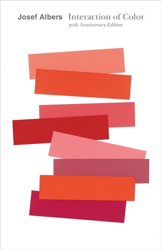
Not a painting but a color study from the book—two squares of identical color appearing different against different backgrounds. This is the argument stripped to its skeleton. No compositional interest, no gesture, no aesthetic pleasure in the conventional sense. Just the effect, isolated. The Josef and Anni Albers Foundation maintains the archive of original studies; the book has never gone out of print since the first paperback edition appeared in 1971. The 50th anniversary edition was published by Yale University Press in 2013, expanding the color study selection to more than 30 plates. The Museum of Modern Art holds a significant collection of Albers’s paintings and prints.
Shop the collection
There are two objects worth owning here. The book is the argument itself; the print is the argument at domestic scale.
Interaction of Color—50th Anniversary Edition: The primary text—not a survey of Albers, but the argument itself, with 30+ color studies and Albers’s complete original text. The only book where the paintings are also the evidence.
Study for Homage to the Square Framed Art Print (20×20 in.): Living with one of these prints is the closest a reader can get to the argument without standing in front of a canvas. The nested-square format works at domestic scale in a way that photographs of the paintings do not—the color relationships are the content.
Further reading
Two books. Not three. The 50th anniversary edition is the one to display; these two are the ones to use.
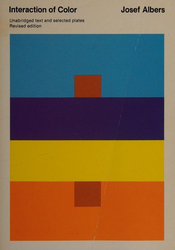
Josef Albers, Interaction of Color (Revised and Expanded Edition, Yale University Press, 2006): The standard paperback edition—more accessible than the 50th anniversary for readers who want to work through the exercises rather than display the book. If the 50th anniversary is for the shelf, this edition is for the desk.
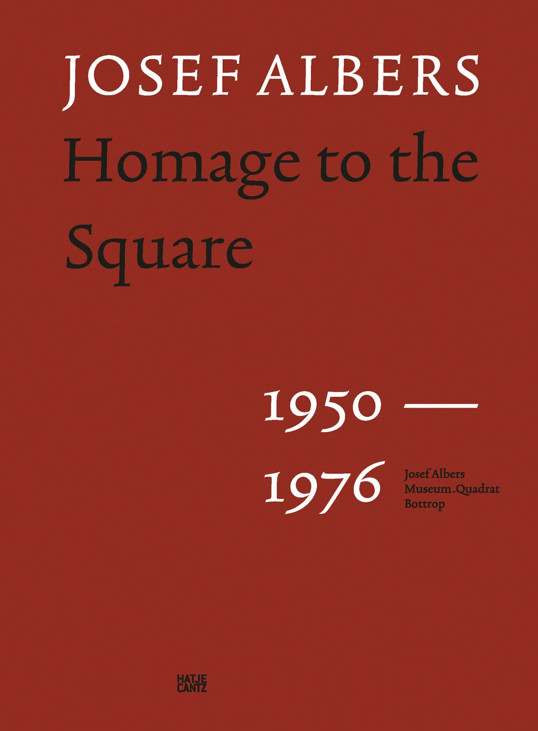
Josef Albers et al., Josef Albers: Homage to the Square, 1950–1976 (Hatje Cantz, 2023): The definitive catalogue of the series—328 pages, 220 color images, essays by Donald Judd and Margit Rowell. This is the book that demonstrates what 2,000 paintings in a single format can argue that a single painting cannot.
Frequently asked questions
What is Josef Albers’s color theory in simple terms?
Albers’s argument is that color has no fixed identity. The same color looks different depending on what surrounds it. This is not a stylistic claim—it is a perceptual fact he demonstrated through controlled experiments, both in his Homage to the Square paintings and in the exercises published in Interaction of Color (1963). Every color is changed by its context. There is no such thing as a color perceived in isolation.
Why did Josef Albers paint the same square over and over?
The format was a control, not a subject. Albers needed every variable except color to remain constant, so he fixed the format (nested concentric squares, fixed proportions, paint applied directly from tube to Masonite) and changed only the colors. Two thousand paintings in the same configuration are not repetition; they are a data set. He recorded every pigment mixture on the back of each panel. The series was a twenty-six-year laboratory experiment conducted in oil paint.
What is Interaction of Color about?
It is about the gap between how a color physically is and how it is perceived. Albers’s thesis: “In visual perception, a color is almost never seen as it really is.” The 1963 original was a limited institutional edition (a folio with 150 silkscreen color plates), not a consumer book. It worked by producing the perceptual effects it described. The first paperback edition appeared in 1971; the 50th anniversary edition in 2013 is the edition in print today.
How does Josef Albers demonstrate that color is not absolute?
Through exercises that make one color look like two different colors, or two different colors look like one. He called the effect the ‘relativity of color.’ No explanation is offered in the book—only the demonstration. The reader’s perception fails in a specific way, and that failure is the evidence. He rejected color systems like Munsell and Itten’s color wheel as inadequate precisely because they treated color as a fixed property that could be catalogued. For Albers, color’s behavior was entirely relational.
Is Josef Albers considered an Abstract Expressionist?
No, and the distinction is structural, not a matter of taste. Abstract Expressionism (Pollock, de Kooning, Kline) operated through gesture and intuition: the artist’s physical act was the content. Albers was doing the opposite: controlled experiment, fixed format, reproducible effects. He was at Yale while Abstract Expressionism dominated critical attention, and critics largely classified him as Op Art or Color Field. He rejected both labels. He considered himself a painter doing experiments. What he shared with his contemporaries was the seriousness of the claim that color carries meaning. The means could not have been more different.
Where can I see Josef Albers’s Homage to the Square paintings in person?
Major holdings are at the Museum of Modern Art in New York, the Smithsonian American Art Museum in Washington, D.C., and the Kunstmuseum Basel. The Josef and Anni Albers Foundation in Bethany, Connecticut, holds the archive and the catalogue raisonné of approximately 3,800 works. Yale University Art Gallery, where Albers spent the last twenty-six years of his career, also holds a significant group.
See also: Anoka Faruqee, Kasarian Dane, The Grid in Contemporary Art, Bauhaus Design Ideas
About Joe Post
Joe Post holds an MFA in Art from California Institute of the Arts (CalArts) and has done additional graduate work at the School of the Art Institute of Chicago. He founded Art Design Ideas to write about design as cultural argument — the decisions, contradictions, and assumptions built into the objects we live with.