Mark Rothko’s color field paintings, large luminous rectangles of layered pigment, were not about color relationships or formal composition. Rothko said so himself. He wanted viewers to weep. The Mark Rothko color field works were emotional traps: confrontation disguised as atmosphere, built to induce the same experience that produced them.
What Rothko Was Actually Trying to Do to You
Mark Rothko is a color field painter. Yes, directly and explicitly: he is among the painters who defined the movement, and his work from 1949 onward is the clearest example of what color field painting was actually capable of.
But the label is useful only if you understand what he was refusing when he accepted it.
He refused the abstraction label entirely. His own words, documented in MoMA collection notes and widely cited in the scholarship: “I’m not interested in relationships of color or form. I’m not interested in the expression of feeling. I’m interested only in expressing basic human emotions — tragedy, ecstasy, doom, and so on — and the fact that lots of people break down and cry when confronted with my pictures shows that I communicate those basic human emotions. The people who weep before my pictures are having the same religious experience I had when I painted them.”
The people who weep before my pictures are having the same religious experience I had when I painted them.
This is not metaphor. Rothko gave gallery and museum staff specific installation instructions: hang the canvases low (about eighteen inches from the floor) and dim the gallery until other paintings disappeared. He wanted the viewer surrounded, not positioned at a reading distance. The person who looks at a large Rothko from across a gallery has missed the mechanism entirely. The paintings were engineered for proximity, for enclosure, for the moment when the canvas fills peripheral vision and there is nothing else.
What is special about Rothko’s paintings, the question that most writing about him skirts, is that they were not made as objects of contemplation. They were built as confrontations. The scale, the installation height, the layered translucent glazes that make color appear to come from within the canvas rather than sit on its surface: all of it was designed to produce a specific physiological and psychological effect. Rothko was not painting about emotion. He was constructing apparatus that induced it.
Born Markus Rothkowitz in Daugavpils (Dvinsk), Latvia, on September 25, 1903, Rothko emigrated to the United States with his family in 1913, settled in Portland, Oregon, and moved to New York City in 1923. He changed his name in 1938. His early work was figurative, then surrealist, then gradually stripped down through the 1940s. The signature color field form emerged around 1949: two or three floating rectangles of layered color, fuzzy-edged, luminous. He worked in that mode until he died in February 1970.
Rothko described the warm colors, the oranges and deep reds of the 1950s, as tragedies. The dark canvases that came later, the ones that look like funerals, he described as more hopeful. The viewer who walks in expecting beauty has been wrong-footed from the start. Rothko wanted something more specific than beauty and more difficult to name.
What Color Field Painting Actually Is
Color field painting is an American abstract painting movement that emerged in the late 1940s and 1950s. Its characteristics are specific and worth naming directly, because the term gets used loosely.
The characteristics of color field painting are: large scale, typically mural-sized, large enough to fill the viewer’s peripheral vision at close distance; areas of flat or layered color as the primary organizing principle, rather than gesture, mark, or figure; soft, dissolved edges between color zones rather than sharp boundaries; layered pigment, often translucent glazes applied in multiple passes, that creates luminosity; the elimination of narrative, symbol, and figure (everything that would let the viewer’s mind make meaning before the color acts on the body); and emotional confrontation as the stated purpose rather than aesthetic pleasure or formal experiment.
The painters most associated with the movement include Rothko, Barnett Newman, Clyfford Still, Helen Frankenthaler, Morris Louis, and Kenneth Noland. They share the large-scale color emphasis, but their methods and intentions diverge considerably. Newman worked with hard-edged vertical bands (“zips”) against flat color fields. Frankenthaler poured diluted pigment directly onto unprimed canvas, staining the fabric. Rothko’s version was the most systematically emotional: every formal decision (scale, edge treatment, palette, installation height) was in service of the direct emotional effect on the viewer standing in front of the work.
What colors did Rothko use? The palette changed across his career, and the change tracks the argument’s intensification. The early mature period (c. 1949–1956): burnt oranges, cerulean and deep blue, saffron, gold, maroon. The Seagram Murals (1958): dark reds, near-blacks, maroon with warm-to-violet undertones. The Rothko Chapel paintings (1964–1969): near-black and deep brown, barely distinguishable from each other, approaching monochrome. The progression is not decorative variety. The color got darker and more enclosed as Rothko pushed the emotional apparatus toward its limit.
Why Rothko Walked Away from the Seagram Commission
In 1958, Rothko accepted a commission to paint murals for the Four Seasons Restaurant in the Seagram Building, Mies van der Rohe’s tower on Park Avenue and the most prestigious dining room in New York. He completed approximately 40 paintings in dark reds and near-blacks, working in a rented carriage house on the Bowery. Then he visited the completed restaurant.
He found what he later described as wealthy people there to perform status. He concluded that his paintings in that room would become expensive wallpaper: objects that signaled sophistication rather than demanded anything from the people sitting next to them. He returned the $35,000 advance and kept the paintings.
He returned the $35,000 advance and kept the paintings.
This is not an artist throwing a fit. It is the clearest statement Rothko ever made about the relationship between his paintings and their audience. The paintings required something from the viewer: willingness to stand close, stay longer than was comfortable, and submit to the color field’s effect rather than observe it from a safe distance. The Four Seasons crowd was not that audience. Hanging the paintings there would have been a category error — the right object in the wrong room, converted by context from confrontation to décor.
Rothko later said he had hoped to “ruin the appetite of every son-of-a-bitch who eats in that room.” The Seagram Murals stayed in storage until 1968. They are now split among three institutions: Tate Britain in London, the Kawamura Memorial Museum in Japan, and the National Gallery of Art in Washington, DC. One of the Tate panels was vandalized in 2012 and subsequently conserved.
The Rothko Chapel in Houston, Texas, commissioned by John and Dominique de Menil and opened February 1971 (one year after Rothko’s death), is the logical endpoint of the argument the Seagram refusal made. Not a gallery that could accommodate the paintings, but a room built specifically to contain and activate their effect. Rothko worked on the commission from 1964 until his death on February 25, 1970. He never saw it completed. The chapel holds 14 canvases in near-black and deep brown tones, in an octagonal space designed by Philip Johnson and Howard Barnstone. It remains active as an interfaith chapel and contemplation space. People sleep on the floor there. People weep.
The Works That Built the Argument
For a different relationship between obsessive visual form and personal experience, see our profile of Yayoi Kusama, whose practice also converted psychiatric compulsion into a repeatable system.
No. 61 (Rust and Blue) (1953), LACMA collection, is the mature technique in clear form. Two rectangles: burnt orange set above deep cerulean, hovering on a dark ground. The edges are not masked or drawn; Rothko built them in concentric passes of progressively diluted pigment, softening by hand until the color dissolves at its own boundary. The luminosity comes from layering: up to thirty translucent glazes that catch and scatter light from within the canvas, not from its surface.
Orange and Yellow (1956), at the Albright-Knox Art Gallery in Buffalo, is the closest Rothko got to warmth without sentimentality. Saffron over gold. The palette sounds pleasant; at scale, it is demanding. The edge mechanism is the same: concentric passes, dissolving boundaries, color that appears to generate its own light.
Black on Maroon (Seagram Mural) (1958) makes the argument about audience visible as paint. Deep maroon field, near-black rectangles at mural scale. Seen close, the black is not flat; it shifts from warm brown to near-violet at the edges, depending on light and viewing angle. In the Four Seasons, that domination would have been ignored. At Tate Britain, in a gallery built to Rothko’s specifications, it works as intended.
Rothko Chapel Black-Form Paintings (1967–1969) are the argument at its end. Near-black tones on grounds of marginally different darkness, the soft-edge effect barely visible. Six years of work. The argument has arrived at silence.
Shop the Collection
There are two books worth owning for this topic.
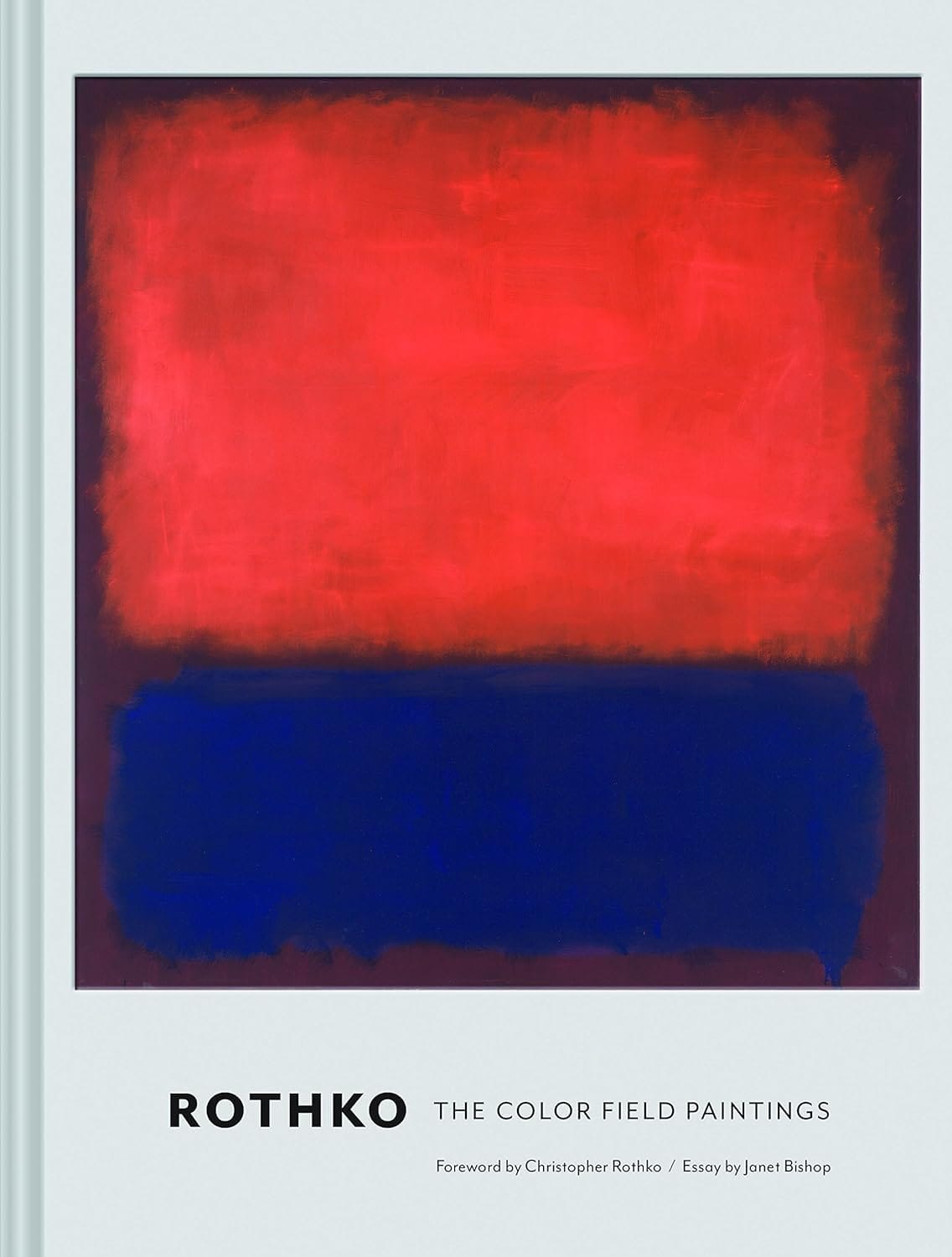
Rothko: The Color Field Paintings
Christopher Rothko and Janet Bishop (Chronicle Books, 2017). Fifty large-scale reproductions from the 1949–1970 color field period, with essays by Rothko’s son and SFMOMA curator Janet Bishop. The reproduction quality is high enough that the layering becomes visible.
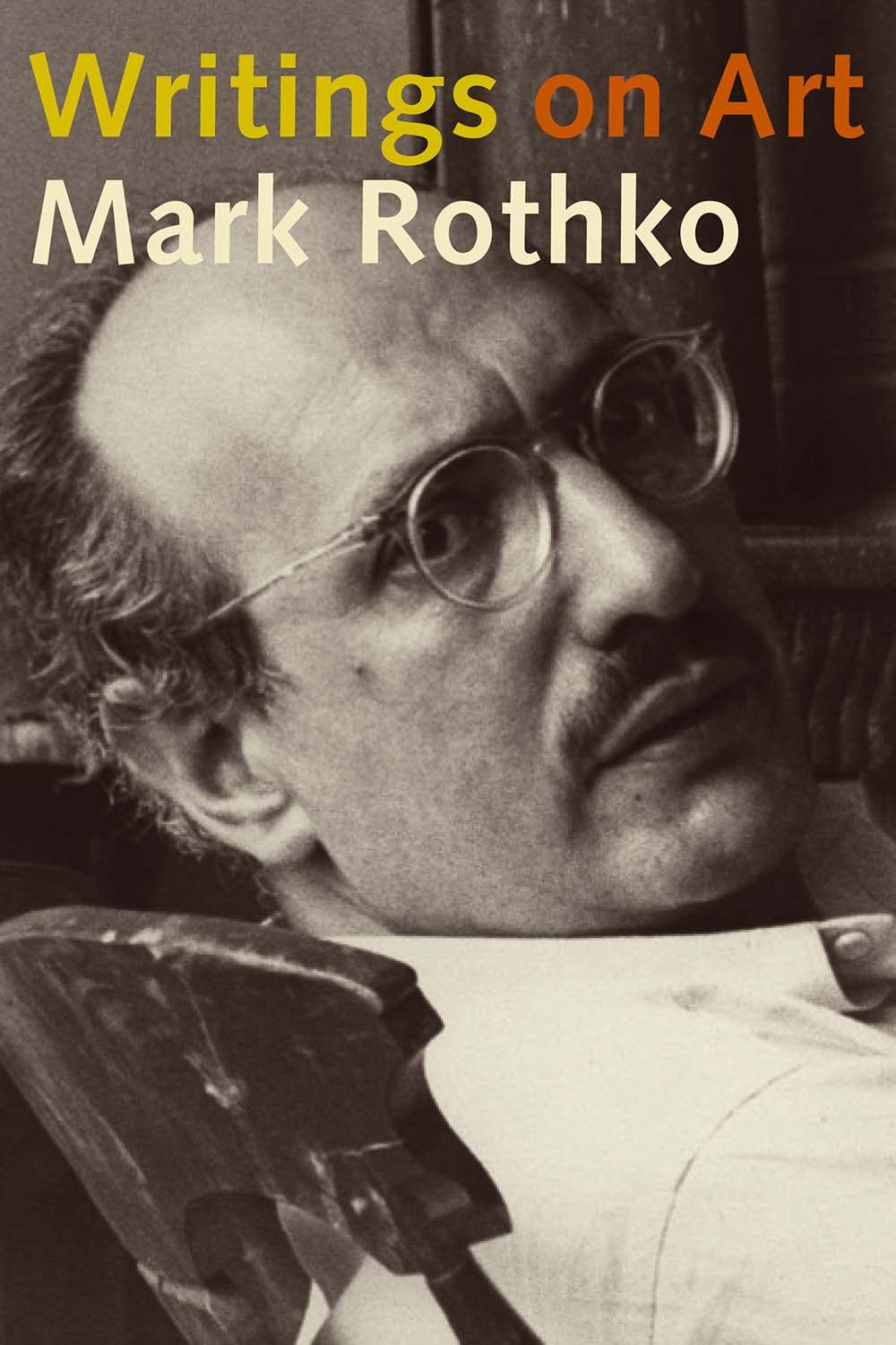
Writings on Art
Mark Rothko, edited by Miguel Lopez-Remiro (Yale University Press, 2006). Approximately 100 texts from 1934 to 1969: letters to Barnett Newman and Robert Motherwell, teaching notes, the philosophical writings where Rothko states his actual intentions. The reader who wants to understand what the color field argument was about should hear Rothko say it directly before reading anyone else’s account.
Further Reading
Mark Rothko, Writings on Art, ed. Miguel Lopez-Remiro (Yale University Press, 2006). The only reliable guide to what Rothko was actually trying to do is what he wrote. These 100 documents end speculation about whether the paintings were color studies or something more. They were always something more. Buy on Amazon
James E. B. Breslin, Mark Rothko: A Biography (University of Chicago Press, 1993). The New York Times called it “the best life of an American painter yet written.” Breslin had access to Rothko’s personal papers and conducted more than 100 interviews. The book covers not just Rothko’s biography but the full Abstract Expressionist milieu and how Rothko’s project moved against and within it. Buy on Amazon
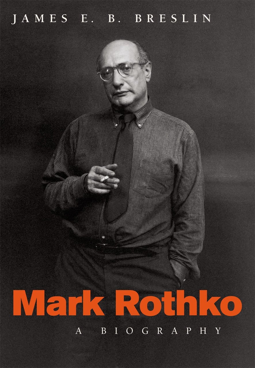
Mark Rothko: A Biography
James E. B. Breslin (University of Chicago Press, 1993). The New York Times called it “the best life of an American painter yet written.” Breslin had access to Rothko’s personal papers and conducted more than 100 interviews. Essential for understanding the full Abstract Expressionist milieu and how Rothko’s project moved against and within it.
For a curated list of essential art and design books beyond these titles, see our best art books guide.
Frequently Asked Questions
What is color field painting?
Color field painting is an American abstract painting movement from the late 1940s and 1950s. Large-scale canvases are organized around areas of flat or layered color rather than gesture or figure. The intent is direct emotional impact through color, scale, and the viewer’s physical relationship to the canvas: not formal experiment or optical effect.
What are the characteristics of color field painting?
Large scale, typically mural-sized; fields of color as the primary element rather than mark or gesture; soft, dissolved edges between color zones; layered translucent glazes that build luminosity; the elimination of figure, narrative, and symbol; emotional confrontation as the stated purpose. In Rothko’s work specifically: low installation height, palette organized for emotional effect rather than visual pleasure, and a surface that appears to generate light from within.
What colors did Rothko use?
In the mature period: burnt oranges, cerulean and deep blue, saffron, and gold in early color field works; dark reds, near-blacks, and maroon-to-violet tones in the Seagram Murals; near-monochromatic near-blacks and deep browns in the Rothko Chapel paintings. The palette darkened across his career as the emotional confrontation he was after became more extreme.
Is Mark Rothko a color field painter?
Yes. Rothko is among the painters who defined color field painting and his mature work from 1949 onward is the movement’s most systematically emotional example.
Is Mark Rothko best known for his hazy color field paintings?
Yes, the mature color field works, large soft-edged rectangles of layered pigment from 1949 onward, are the basis of Rothko’s reputation. The “hazy” quality comes from his edge treatment: concentric passes of progressively diluted pigment that dissolve the boundary between color zones rather than defining it.
What is Mark Rothko’s color field technique?
Thin, translucent glazes of diluted pigment applied over dried previous layers, often 20 to 30 passes, building color that appears to emanate from within the canvas. Edges between rectangles were not masked — they were painted by hand in concentric passes, softening progressively toward the boundary. Scale and low installation height were part of the technique: the canvas was meant to enclose the viewer.
Why did Rothko refuse the Seagram Murals commission?
After completing approximately 40 large-format paintings for the Four Seasons Restaurant in the Seagram Building, Rothko visited the completed dining room and concluded that the audience was wrong. Wealthy diners performing status were not the viewers his paintings required: ones willing to stand close, stay long, and submit to the color field’s effect. He returned the $35,000 advance. The paintings stayed in storage until 1968; they are now at Tate Britain, the Kawamura Memorial Museum in Japan, and the National Gallery of Art in Washington.
What is the Rothko Chapel and where is it?
A non-denominational interfaith chapel in Houston, Texas, containing 14 of Rothko’s near-black canvases in an octagonal space built specifically for the paintings. Commissioned by John and Dominique de Menil, it opened February 1971, a year after Rothko’s death. It remains active as a chapel and meditation space.
Why do people cry in front of Rothko paintings?
Because Rothko built them to produce that effect. The scale, the low installation, the layered luminosity, the absence of figure or narrative: these remove every familiar cognitive handle and leave only color acting on the nervous system at close range. Rothko said directly that viewers who wept before his paintings were “having the same religious experience I had when I painted them.”
What was the basic point of Mark Rothko’s large color field paintings?
Direct emotional confrontation, without mediation. No narrative, no gesture, no figure; nothing that would let the viewer intellectualize past the painting’s effect. Rothko wanted tragedy, ecstasy, and doom transmitted from painter to viewer through layered color alone. The large scale and low installation height were the delivery system.
How should you look at a Rothko painting?
Get close, closer than feels correct. Rothko specified canvases be hung about 18 inches from the floor so the viewer stands inside the painting’s field. Stay longer than feels comfortable. The layering, the edge dissolve, and the depth of color only become visible with time and proximity.
About Joe Post
Joe Post holds an MFA in Art from California Institute of the Arts (CalArts) and has done additional graduate work at the School of the Art Institute of Chicago. He founded Art Design Ideas to write about design as cultural argument — the decisions, contradictions, and assumptions built into the objects we live with.