Raymond Loewy inspired products carry a signature logic: they look slightly ahead of their moment but never out of reach. The MAYA principle — Most Advanced Yet Acceptable — was Loewy’s operating rule. These picks apply that same test: streamlined kitchenware, design books, and barware that still hold up.
Our Top Picks
These five objects earned their place by the same standard Loewy applied in practice: does it move the needle far enough to be interesting, but not so far that it alienates the room it’s going into?
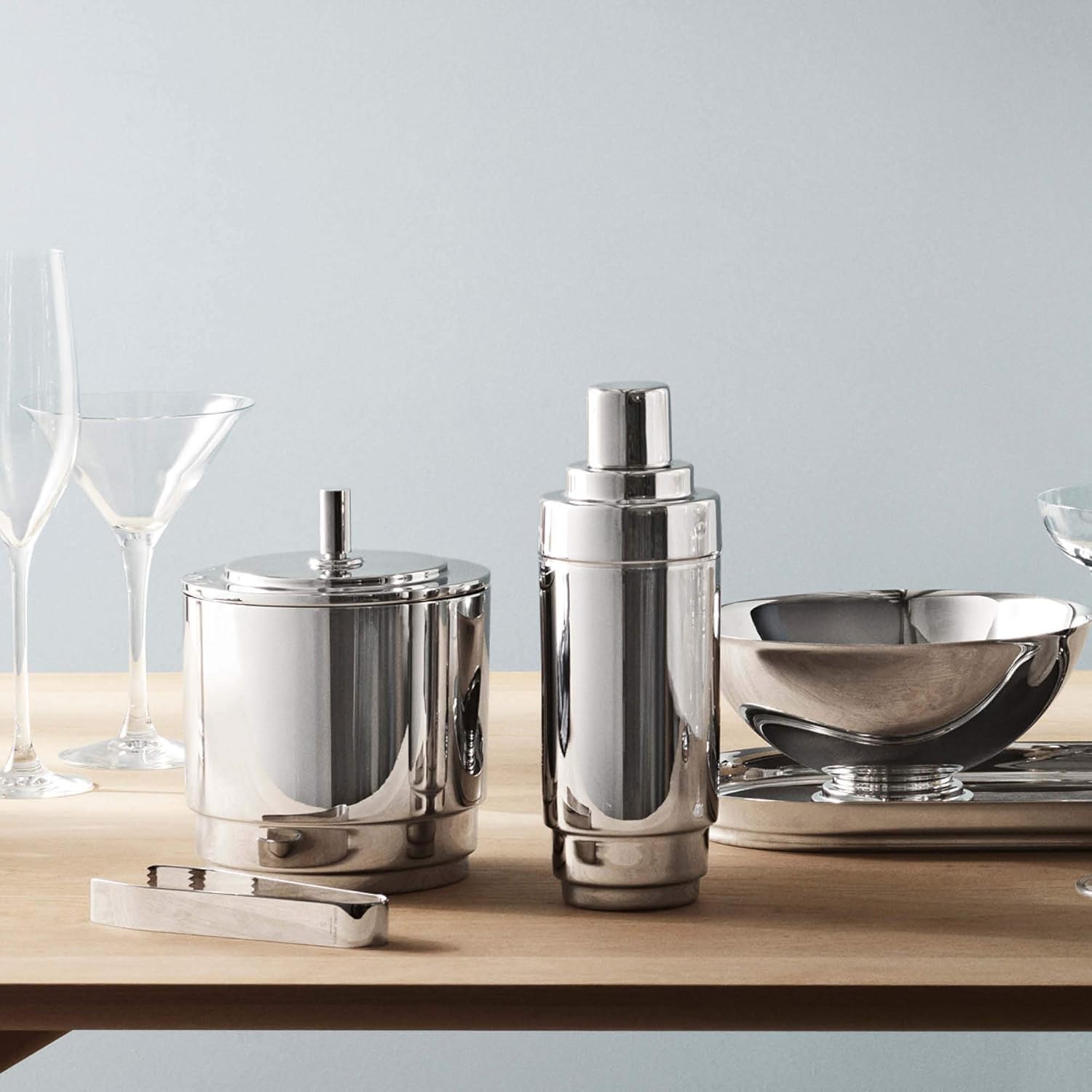
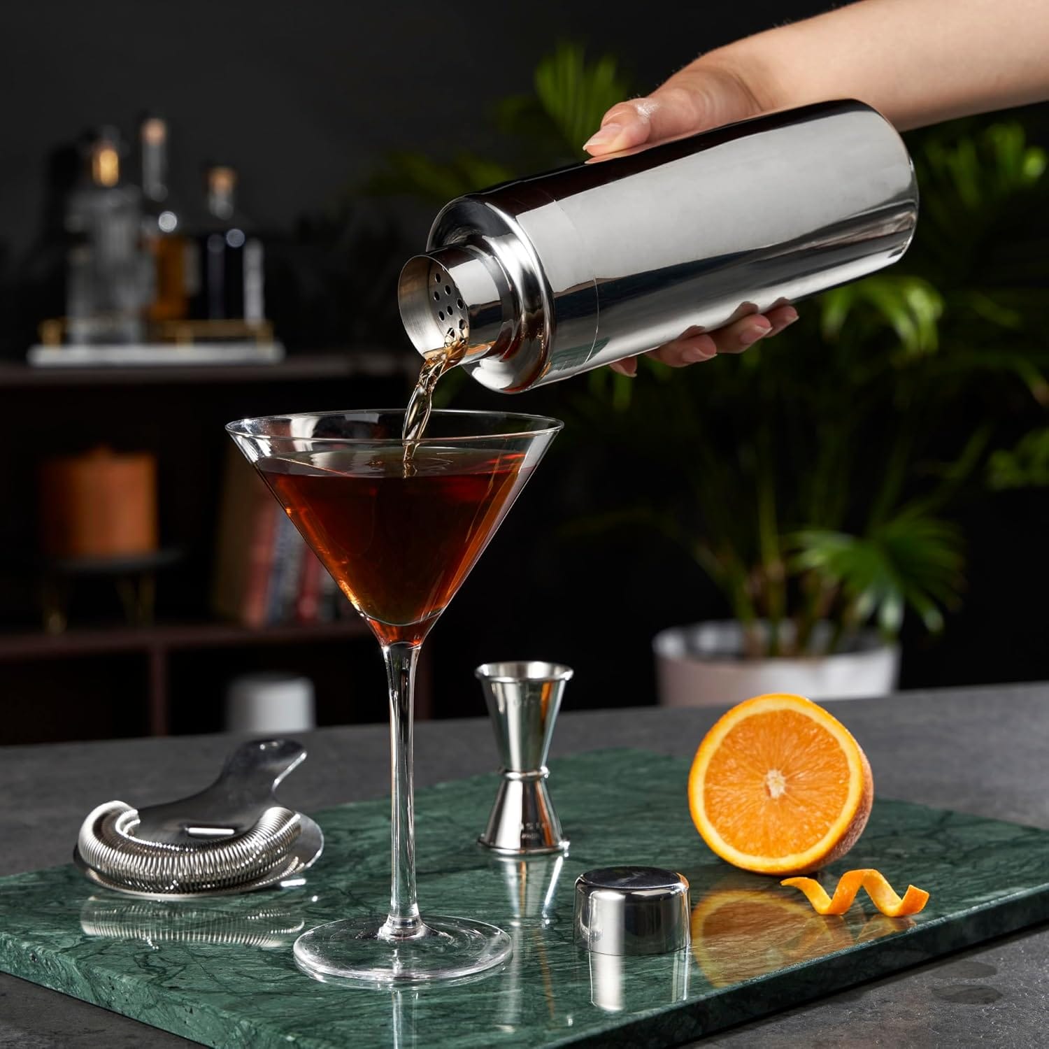
- Georg Jensen Manhattan Cocktail Shaker (Mid-Range): Georg Jensen’s Manhattan line applies the same streamlined steel vocabulary Loewy brought to the Greyhound Scenicruiser — the shaker looks current without looking like it’s trying.
- Viski Art Deco Gold Cocktail Shaker (Mid-Range): The etched geometry references the same 1930s streamline vocabulary Loewy used on the Pennsylvania Railroad GG1 locomotive — decorative detail subordinated to a clean silhouette.
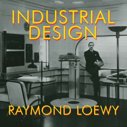
- Raymond Loewy, Industrial Design (Overlook Press, 1979) (Mid-Range): The primary source — Loewy’s own retrospective with photographs of every major project, from the Coldspot refrigerator to the Skylab interior. No substitute.
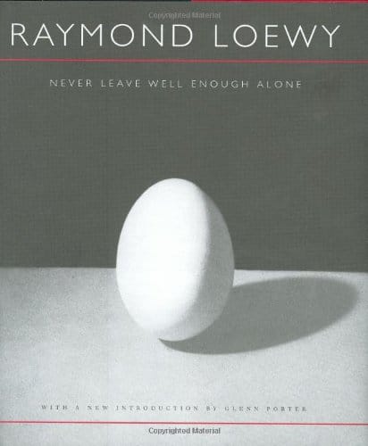
- Raymond Loewy, Never Leave Well Enough Alone (Johns Hopkins University Press, 2002) (Budget): Loewy’s autobiography reads like a compressed design education — every chapter is a case study in the MAYA principle applied under commercial pressure.
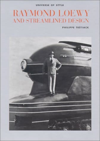
- Philippe Tretiack, Raymond Loewy and Streamlined Design (Mid-Range): Best visual survey of Loewy’s commercial output — useful if you want to see which product categories still carry his formal language.
Quick Decision Guide
- Best for design credibility: Georg Jensen Manhattan Cocktail Shaker — the MAYA principle made tangible in steel; it is a shelf object as much as a bar tool.
- Best budget option: Never Leave Well Enough Alone — Loewy’s own voice on the MAYA principle, under $20 in most editions and more useful than most design theory on the shelf.
- Best premium gift: Viski Art Deco Gold Cocktail Shaker — the gold finish moves it past bar accessory into design object territory without an heirloom price tag.
- Best for design research: Industrial Design by Loewy — the full project catalog, indispensable for anyone studying streamline modernism or the commercial roots of American industrial design.
Full Comparison
| Product | Best For | Price Range | Key Feature | Link |
|---|---|---|---|---|
| Georg Jensen Manhattan Cocktail Shaker | Design-forward barware | Mid-Range | Streamlined stainless, Art Deco silhouette | View on Amazon |
| Viski Art Deco Gold Shaker | Gift buying | Mid-Range | Etched geometry, gold electroplate finish | View on Amazon |
| Industrial Design by Loewy | Design research | Mid-Range | Full project retrospective, primary source | View on Amazon |
| Never Leave Well Enough Alone | Understanding MAYA | Budget | Loewy autobiography, MAYA principle in practice | View on Amazon |
| Raymond Loewy and Streamlined Design | Visual overview | Mid-Range | Best breadth survey of Loewy’s commercial output | View on Amazon |
Which Loewy-inspired objects actually hold up?
Georg Jensen Manhattan Cocktail Shaker
Pros:
- Genuine design provenance — Georg Jensen’s Manhattan line is built on Art Deco streamline language, not a trend imitation
- Mirror-polished stainless holds up to shelf display and regular use
- 25 oz capacity is practical for two-person cocktails without requiring a second shake
Cons:
- Premium price point relative to generic shakers — you’re paying for the formal language, not just the function
- Not dishwasher-safe; hand wash only
Who it’s for: Buyers who want barware that earns its counter space even when it isn’t being used.
Why it stands out: Of all the streamline-inspired barware on the market, this one is the least nostalgic — it reads as a design decision, not a period piece. The connection to Loewy is formal, not historical: Georg Jensen’s Manhattan line draws from the same 1930s streamline vocabulary Loewy worked in, not from Loewy’s designs specifically. What makes the comparison useful is the shared aesthetic logic.
Viski Art Deco Gold Cocktail Shaker
Pros:
- Under $40, which makes the Art Deco geometry accessible without a long-term commitment
- Etched detail is genuinely precise rather than screen-printed — it ages better
- Holds its shape under regular use; the cap seals cleanly
Cons:
- Gold finish shows wear on heavy daily use — better suited to occasional than daily bar work
- 24 oz is slightly smaller than the Jensen; marginal for hosting
Who it’s for: Gift buyers who want the formal vocabulary of 1930s streamline design without the heirloom commitment.
Why it stands out: The etched geometry is closer to Loewy’s GG1 locomotive detail work than most products in this price range — it’s doing the reference honestly, not decoratively.
Raymond Loewy, Industrial Design (Overlook Press, 1979)
Pros:
- Loewy’s own photography and commentary covers the full career arc from the 1920s through NASA Skylab
- Reproduction quality is high; the GG1 and Coldspot spreads hold up on the shelf
- Covers logos, transportation, packaging, and interiors in one volume — no other Loewy book does this
Cons:
- Out of print in some editions; pricing varies significantly depending on condition and seller
- 1979 perspective means no discussion of Loewy’s posthumous influence or reception
Who it’s for: Designers and design-history readers who want the full picture, not a greatest-hits summary.
Why it stands out: This is the primary source — Loewy’s own selection of what mattered in his career. Everything else about him is someone else’s interpretation of this book.
Raymond Loewy, Never Leave Well Enough Alone (Johns Hopkins University Press, 2002)
Pros:
- Loewy’s autobiography is readable in a way most design writing is not — he writes like someone who has been in rooms making decisions, not observing them
- The MAYA principle is explained from its original source, with the commercial context that generated it
- First-hand client stories (Lucky Strike, Studebaker, Pennsylvania Railroad) read as case studies the reader can actually apply
Cons:
- Written in 1951, which means the perspective stops at mid-century; later projects like Skylab and the Exxon logo are not covered
- No color photography — the 2002 reprint is a text-first experience
Who it’s for: Anyone who wants to understand why the MAYA principle still works commercially, in Loewy’s own language rather than a design critic’s summary.
Why it stands out: Every design principle in this book was tested under real commercial pressure with real client money — the theory is inseparable from the practice.
Philippe Tretiack, Raymond Loewy and Streamlined Design
Pros:
- Visual focus — photographs of Loewy’s work across logos, interiors, and transportation in a single coherent survey
- Good introduction for readers new to Loewy who want breadth before depth
- Covers the range of categories Loewy worked in, which helps place the objects in context
Cons:
- Prose style leans academic-adjacent — less readable than Loewy’s own writing
- Older printing; image reproduction is adequate rather than exceptional
Who it’s for: Readers coming to Loewy fresh who want a visual map of his output before committing to the primary sources.
Why it stands out: It’s the only survey that treats Loewy’s commercial breadth — logos alongside locomotives alongside interiors — as the point, rather than a curiosity.
Why Loewy’s logic still governs what sells
The MAYA principle is a commercial thesis, not an aesthetic preference. Loewy’s argument — “The adult public’s taste is not necessarily ready to accept the logical solutions to their requirements if the solution implies too vast a departure from what they have been conditioned into accepting as the norm” (Never Leave Well Enough Alone, 1951) — was built on actual market research, not design intuition. He tested the Coldspot refrigerator by observing which formal changes consumers noticed and which they dismissed. The result was a five-fold increase in Sears sales within two years of the redesign.
That logic has moved into consumer electronics, contemporary barware, and the Braun-adjacent kitchenware market — products that pass the MAYA test tend to age without becoming caricatures of their era. They don’t overcorrect toward novelty, so they don’t date when novelty becomes dated. The Georg Jensen Manhattan line, the design books in this list — they are all making the same argument in different materials. Buy the version of things that has already survived one cycle of trends, not the version that is riding one.
Frequently Asked Questions
What is the MAYA principle in design?
MAYA stands for Most Advanced Yet Acceptable. It is Raymond Loewy’s core design philosophy, formalized in his 1951 autobiography Never Leave Well Enough Alone. The principle holds that consumers resist designs that move too far from what they already accept — the goal is to find the furthest point of innovation within the current tolerance for change. Objects that pass the MAYA test tend to age well because they resist trend extremes on both ends.
What products did Raymond Loewy actually design?
Loewy’s career spanned 1909 to 1980 and included the Sears Coldspot refrigerator (1935), the Pennsylvania Railroad GG1 locomotive, the Lucky Strike package redesign (1942), the Studebaker Avanti (1963), the Air Force One livery (1962), the Shell logo redesign (1971), the Coca-Cola bottle redesign (1955), and the NASA Skylab interior (1967–1973). He also redesigned the Greyhound Scenicruiser interior and the Exxon logo.
Are there any Raymond Loewy products still in production?
Loewy died in Monte Carlo on July 14, 1986. The Shell logo he redesigned in 1971 remains in worldwide use, and the Air Force One livery he designed in 1962 was used until 2019. Georg Jensen’s Manhattan cocktail shaker and similar Art Deco streamline barware continue the formal language his commercial work established, though they are not produced by Loewy’s firm.
How can I tell if a product embodies Loewy’s design philosophy?
Apply the MAYA test yourself: does the object look slightly ahead of its moment without looking alien in the room? Does the silhouette read immediately, or does it require study to understand? Does the form make the use easier, or does the form fight the function? Objects that pass all three questions are operating in the same space Loewy was working in — close enough to familiar to be acceptable, far enough from familiar to be interesting.
What is the best Raymond Loewy book for beginners?
Never Leave Well Enough Alone (1951, reprinted by Johns Hopkins University Press in 2002) is the better starting point because Loewy explains the MAYA principle in his own words, with the commercial stories that generated it. Industrial Design (1979) is the essential visual reference — Loewy’s own project catalog with photographs — but it works better as a second book, after the autobiography has established the framework.
Why does streamline design still look modern?
Streamline design sits at the MAYA point for its original era — advanced enough to read as forward-thinking, familiar enough not to alienate. That calibration is what prevents it from aging out. When designs overcorrect toward novelty, they date when novelty shifts. Streamline forms — the vocabulary Loewy used across the GG1, the Coldspot, the Scenicruiser — were optimized for legibility and reduction, which means they don’t accumulate the period signals that make other mid-century work look like costumes.
For the broader context of this work, see the Design Brands & Ateliers hub — a guide to the brands and studios driving contemporary design. The full profile of Loewy’s career is in our Raymond Loewy guide. For books covering his philosophy and methods, see best Raymond Loewy books.

About Zoe Post
Zoe Post holds a BFA and a Master of Architecture from the School of the Art Institute of Chicago. She now works as a product marketing leader at an architectural product design firm, bringing hands-on industry perspective to everything she writes. At ADI she covers contemporary artists, textile and pattern design, and the design objects that sit at the boundary of art and function.