Kasarian Dane is an American painter who makes reductive stripe paintings on aluminum, a non-porous industrial support that refuses canvas’s warmth and depth. Working in oil and flashe since the mid-1990s, Dane builds horizontal and vertical color fields that insist on surface rather than illusion. His gallery is Minus Space, Brooklyn.
Why Kasarian Dane Paints on Aluminum
The problem Dane ran into during his MFA at the School of the Art Institute of Chicago was the edge. Canvas has one — a stretched boundary where color runs out of room, tapers, becomes a formal decision the painter may not want to make. Around 1996 or 1997, Dane moved to aluminum, and that decision resolved the edge problem by eliminating it. The aluminum panel simply ends. But in resolving the edge, it opened a larger question about what the support was doing to the color in the first place.
Canvas absorbs paint. It pulls the paint in, diffuses it, creates the optical suggestion of depth behind the surface. This is not accidental: it is the ground of Western painting’s window convention, the thing that allows a flat surface to perform three-dimensional space. Aluminum does none of this. It reflects. The paint sits on top and stays there. No absorption, no ground, no window.
Dane’s shift from canvas to aluminum was a material decision that turned out to be a philosophical one: he was refusing the painting-as-illusion convention at its source. The philosophical weight Dane places on this choice is elaborated in his Bands of Color interview with Brent Hallard (2009) and confirmed by James Yood’s Artforum framing, which treats the material as genuinely argumentative rather than merely unusual, a reading that Minus Space’s institutional context for reductive painting as current practice further supports.
By 1999, Dane had worked out the construction fully: 1/8” aluminum panels mounted one inch from the wall on welded bracket systems, as he described in a 2009 interview with Brent Hallard (Bands of Color: Kasarian Dane, Visual Discrepancies blog). The mounting matters. The panel floats off the wall, which means it is an object in the room rather than a window onto another one. It is there: physically, materially, defiantly there. David Batchelor writes, in Chromophobia (Reaktion Books, 2000), that “to fall into colour is to run out of words.” Dane uses that line as an epigraph on his faculty page at St. Lawrence University, which is as direct a statement of intent as a painter usually makes.
The institutional context for where this practice lives came into focus in 2008, when the Museum of Modern Art’s PS1 space hosted Minus Space – The Art of Reduction, a survey of 54 artists from 14 countries curated by Phong Bui. Minus Space, the Brooklyn gallery and organization founded around 2003 by Matthew Deleget, had been building the critical frame for reductive painting as a current (not a nostalgic) practice. Dane’s inclusion in that survey placed his work within the generation of painters who turned the support into a philosophical position, as described in the abstract expressionism art history post. His aluminum panels were among the works that made the case that reductivism was not a retreat but an argument.
What Dane’s Stripes Do That Color Field Painting Didn’t
The obvious comparison is Color Field painting, and it is worth making precisely, because the precision is where Dane’s work becomes visible.
In classical Color Field (Rothko, Morris Louis, Helen Frankenthaler) color soaks into canvas. The staining technique is exactly that: the paint enters the support, diffuses, dematerializes the surface. This is how Rothko achieves the luminous atmosphere his paintings are known for: you are not looking at a painted surface; you are looking through it. The painting becomes a kind of weather. What Color Field painting was doing with absorption and depth, described at length in the Rothko profile, was building transcendence out of material disappearance. The support supports the illusion by getting out of the way.
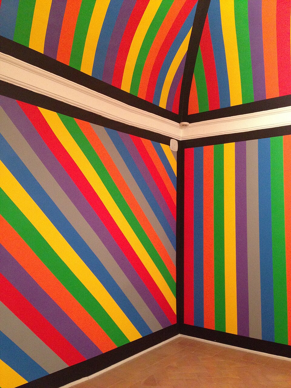
Dane’s aluminum does the opposite. The support refuses to disappear. Color sits on top, and the surface announces itself — reflective, hard, present. This is a structural refusal of Color Field’s transcendence gambit, not a stylistic one. Dane does not want the beauty to depend on pretending the painting is not a physical object.
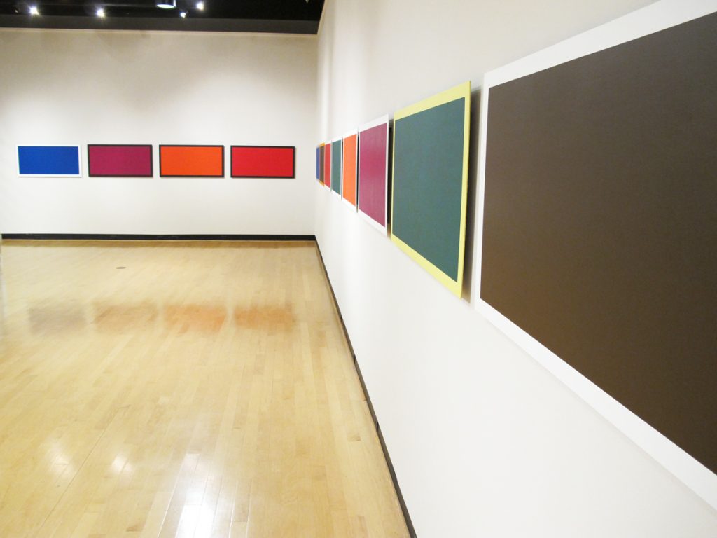
The lineage that is more useful is Ellsworth Kelly and Josef Albers. Kelly’s panels are separate colored shapes that function as objects: color and shape are not on the canvas; they are the canvas. Dane’s aluminum panels share this object-ness, but where Kelly tends toward monochrome fields that make color synonymous with form, Dane works in stripes, which means color is relational rather than absolute. Three stripes of adjacent blue and orange and yellow are not three color statements; they are a single argument about how those colors behave next to each other.
Albers spent Interaction of Color (Yale University Press, 1963) demonstrating that color has no fixed identity; what a color appears to be depends entirely on what surrounds it. Dane teaches a course by that name at St. Lawrence University, which is not incidental. The pedagogical link is a direct statement about the operating system his paintings run on.
James Yood, reviewing Dane’s 2006 exhibition Co: lor at Rowland Contemporary in Chicago for Artforum (February 2007), called the central challenge of the work this way: “The tightrope that Dane walks is to make reductivism a platform for expansiveness.” Yood (a longtime Artforum contributor and SAIC professor who died in 2018) was describing the paradox that Dane’s own language points toward: “when the paintings really work, there’s something more there than a formal arrangement of color” (Bands of Color interview, 2009). Yood’s critical framing and Dane’s own description of his goal (what he calls “the Zone,” a state where colors achieve unity beyond their individual properties) converge on the same point. Restraint, taken seriously enough, becomes a vehicle for something the restraint itself cannot fully account for.
This distinguishes Dane’s work from the less interesting version of reductivism, which performs austerity as an end in itself. The stripes are not there to signal rigor. They are there because stripes create the maximum number of color adjacencies in the minimum amount of compositional structure — they are an efficiency, not an aesthetic.
Five Paintings That Map the Argument
Dane does not title his paintings. Every work is untitled, consistently documented across his exhibition record and confirmed in the Bands of Color interview. For this reason, his practice is tracked through series names and exhibition contexts rather than individual titles.
Co: lor series, 2006 — Rowland Contemporary, Chicago
Fifteen untitled paintings shown at Rowland Contemporary, Chicago, reviewed in Artforum by James Yood in February 2007. Oil and flashe on aluminum. Panels divided into three to ten stripes, widths varying from just over one inch to approximately one foot within a single work. Surface finish varies, from high gloss to dusky matte, within individual pieces, not just across the show. Yood noted that “whatever equipoise is evident in each painting was achieved in fits and starts”: the masking lines and earlier paint layers remain visible in the finished work. The process shows. Dane considers this a feature, not a flaw. The exhibition also included three stacked suites of four panels each, Dane using installation to extend color relationships across separate objects, the series becoming a single extended argument.
Original Six series, 2009 — 106 Gallery, Calvin College, Grand Rapids
At the time of the Bands of Color interview, Dane had 30 aluminum panels simultaneously in progress, each 24” × 48”. He described this practice of working across many panels at once as essential to the color thinking: a color decision on one panel changes how he reads the adjacent panels. This use of serial repetition as a structural method, where working across multiples generates the argument rather than illustrating it, connects Dane’s approach to a broader logic explored in the Yayoi Kusama design language post. The series explores expanded central color areas surrounded by adjacent tones, with color field logic operating from within a stripe structure rather than against it. The Calvin College exhibition, Original Six, was a solo show at 106 Gallery in Grand Rapids, Michigan.
Paintings on Location series (ongoing)
Dane photographs his aluminum panels placed in different site conditions (different light, different rooms, different contexts) and documents how the same painting reads differently depending on ambient light. The aluminum’s reflectivity means the painting is not a fixed object; it is a fixed object in a variable relationship with its environment. This is not documentation of the work; it is part of the argument about surface as active rather than neutral. The series is ongoing and documented on Dane’s St. Lawrence faculty site.
Minus Space – The Art of Reduction, MoMA PS1, 2008
Dane’s inclusion in this survey alongside 53 international artists placed his aluminum paintings within the broadest available critical frame for reductive painting as a contemporary practice. According to the Wikipedia entry for Minus Space, the exhibition drew from 14 countries and was organized by Phong Bui, at the time editor of the Brooklyn Rail. The institutional framing matters: this was not a historical survey. It was an argument that reduction was a current methodology, not a period style.
Paper studies (ongoing)
Dane maintains paper studies as a parallel practice to the aluminum panels. These provide what he calls “creative fluidity” in the Bands of Color interview. The studies are preparatory but also autonomous color exercises, a way of moving through color decisions without the permanence and physical resistance of the aluminum. They are the thinking-out-loud that the finished panels do not permit.
Shop the Collection
Two books sit at the center of Dane’s practice: one pedagogical, one a direct historical precedent. If you are going to spend money on anything after reading this post, spend it on these.
- Josef Albers, Interaction of Color, 50th Anniversary Edition (Yale University Press, 2013): Dane teaches a course by this name. That is not a coincidence: it is a direct statement that Albers’s framework of color as relational rather than fixed is the operating system for how his stripe relationships work. If you want to understand why adjacent stripe widths matter, this is the book that explains the mechanism. If you are looking to bring reductive color into a room (posters, prints, textile decisions), best art prints for modern interiors is a useful starting point for thinking about how that looks at scale.
- Tricia Y. Paik, Ellsworth Kelly (Phaidon Press, 2015): Kelly’s paintings are the closest historical precedent for Dane’s insistence that color can function as a physical presence rather than an illusion. Paik’s monograph traces the full development of Kelly’s hard-edged color thinking from his time in Paris in the 1940s through his final work; reading it alongside Dane’s aluminum panels clarifies what Dane is extending and, specifically, where he departs: Kelly makes the panel monochrome; Dane makes it relational.
Further Reading
There are books that are background and books that are the argument. This one is the argument. For more on books that take color seriously as a critical problem, the ADI reading list is a useful starting point.
- David Batchelor, Chromophobia (Reaktion Books, 2000): The primary theoretical framework for what Dane’s reductive aluminum paintings are doing. Batchelor’s examination of color’s marginal status in Western aesthetics (its association with the cosmetic, the feminine, the irrational, the Eastern) explains exactly the cultural position that a painter who insists color is the subject, not the decoration, is operating against. This is not context. It is the argument.
- Phong Bui, ed., Minus Space: The Art of Reduction (Minus Space, 2008): The exhibition catalogue for the MoMA PS1 survey that placed Dane’s work in its broadest institutional context. Includes work by 54 artists from 14 countries and the critical framing that defined reductive painting as a current methodology rather than a period style. A primary reference for understanding where Dane’s practice sits within the contemporary reductive tradition. Available through library systems or directly from Minus Space (minusspace.com).
Frequently Asked Questions
What does Kasarian Dane paint on, and why does the support matter?
Dane paints on aluminum: specifically 1/8” aluminum panels mounted one inch from the wall on welded brackets. The support matters because aluminum does not absorb paint the way canvas does. Canvas pulls paint in, which creates the optical suggestion of depth behind the surface. Aluminum refuses absorption: paint sits on top, remains on top, and the surface stays present. This is not a material preference; it is a structural argument about what a painting is allowed to do.
How is Dane’s work different from Color Field painting?
Classical Color Field painting (Rothko, Louis, Frankenthaler) depends on the staining technique: paint soaks into canvas, the surface dematerializes, and the painting achieves atmospheric depth. Dane’s aluminum inverts this. Color sits on the surface and stays there. The support does not disappear; it insists on itself. Where Color Field painting builds transcendence by making the canvas vanish, Dane’s aluminum panels refuse to vanish. They remain objects in the room rather than windows onto another space.
What is reductive painting, and where does Dane fit in that tradition?
Reductive painting is a broad tendency in abstract art that works by subtraction, limiting compositional elements (color count, geometric complexity, surface incident) in order to focus attention on what remains. The movement has roots in hard-edged abstraction and minimalism, and Minus Space, the Brooklyn gallery and organization founded around 2003 by Matthew Deleget, has organized the current iteration of the practice. Dane fits within this tradition through his gallery affiliation with Minus Space and his inclusion in the 2008 MoMA PS1 survey Minus Space – The Art of Reduction, but his version of reductivism is explicitly relational: the stripes create adjacency rather than isolation, which complicates the more austere versions of the tendency.
Where can I see Kasarian Dane’s paintings?
Dane’s primary gallery is Minus Space in Brooklyn, New York, and he is also listed with White Columns in New York. His work has been shown at institutions including MoMA PS1 in New York, Rowland Contemporary in Chicago, and internationally in London, Munich, and Paris. His faculty page at St. Lawrence University (sites.stlawu.edu/kasariandane) documents exhibitions and includes images of work in different site conditions.
Why does Dane use stripes rather than monochrome panels?
The stripe is a compositional choice about color relationships. A monochrome panel (Ellsworth Kelly’s approach) makes color synonymous with form: the color is the shape. Dane’s stripes separate color from form and make color relational: the same blue reads differently against orange than it reads against yellow. Stripes also create the maximum number of color adjacencies in the minimum compositional structure, which means more relational information per painting without adding compositional complexity. Dane describes his goal as achieving what he calls “the Zone,” a state where the colors in a given painting achieve unity beyond their individual properties (Bands of Color interview, 2009).
What does David Batchelor’s Chromophobia have to do with Dane’s practice?
Dane displays a line from Chromophobia, “To fall into colour is to run out of words,” as an epigraph on his own faculty page at St. Lawrence University. That is a primary-source statement about his theoretical orientation. Batchelor’s argument in the book is that Western culture has historically treated color as dangerous, irrational, and cosmetic: as something to be controlled rather than experienced. Dane’s paintings, by insisting that color is the subject rather than the decoration, are operating against exactly that tradition. The epigraph is not background reading. It is a position statement.
About Joe Post
Joe Post holds an MFA in Art from California Institute of the Arts (CalArts) and has done additional graduate work at the School of the Art Institute of Chicago. He founded Art Design Ideas to write about design as cultural argument — the decisions, contradictions, and assumptions built into the objects we live with.