Art prints for modern interiors are prints of significant artworks, or original graphic work in a movement’s language, chosen as design objects rather than decoration. The right print anchors a room’s visual argument. The wrong one undermines it. This guide covers two registers, Bauhaus geometry and abstract color field, and sticks to prints that are licensed by the rights holder or are original designs.
Our Top Picks
Each pick takes a position. A Bauhaus-language set argues for geometry as a formal principle. A Rothko print argues for atmosphere over object. For artists still in copyright, like Rothko, ADI recommends only prints the rights holder has licensed, which in practice means museum shops. Unlicensed posters of copyrighted paintings are common online, and we do not link to them.
- Mark Rothko, Orange and Tan, 16×20 print (National Gallery of Art Shop, $40): A licensed print of a painting in the National Gallery’s own collection. The warm register suits living rooms and bedrooms.
- Mark Rothko, No. 8, 11×14 print (National Gallery of Art Shop, $20): A smaller licensed print from Rothko’s transitional 1949 period, when the color fields were still loosening into their final form. Good for a desk wall or a gallery grouping.
- HAUS AND HUES Bauhaus Poster Art Set of 3 (Amazon, about $55 framed): Three original blue and yellow compositions in the Bauhaus visual language, rather than copies of any one artist’s work. Sold framed or unframed.
- Christopher Rothko and Janet Bishop, Rothko: The Color Field Paintings (Amazon, book): If you want to live with Rothko’s work at scale before buying a print, this is the book to own: large plates of the classic paintings, with an essay by the artist’s son.
The National Gallery’s full Mark Rothko collection includes framed versions and larger formats.
Quick Decision Guide
- Best for minimalist rooms: HAUS AND HUES Bauhaus Set. One visual language, clean geometry, a primary palette; it reads as a formal decision, not a decorating choice.
- Best for a statement wall: Rothko, Orange and Tan. Color-field prints need wall space to breathe, and 16×20 is the smallest size that starts to do it.
- Best entry price: Rothko, No. 8. A licensed museum print for $20.
- Best for learning the work first: Rothko: The Color Field Paintings.
Full Comparison
| Best For | Price (Sept 2026) | Rights | Link | |
|---|---|---|---|---|
| Rothko, Orange and Tan, 16×20 | Statement wall, warm rooms | $40 | Licensed museum print | NGA Shop |
| Rothko, No. 8, 11×14 | Desk wall, gallery grouping | $20 | Licensed museum print | NGA Shop |
| HAUS AND HUES Bauhaus Set of 3 | Minimalist rooms | about $55 | Original designs | Amazon |
What each print actually delivers
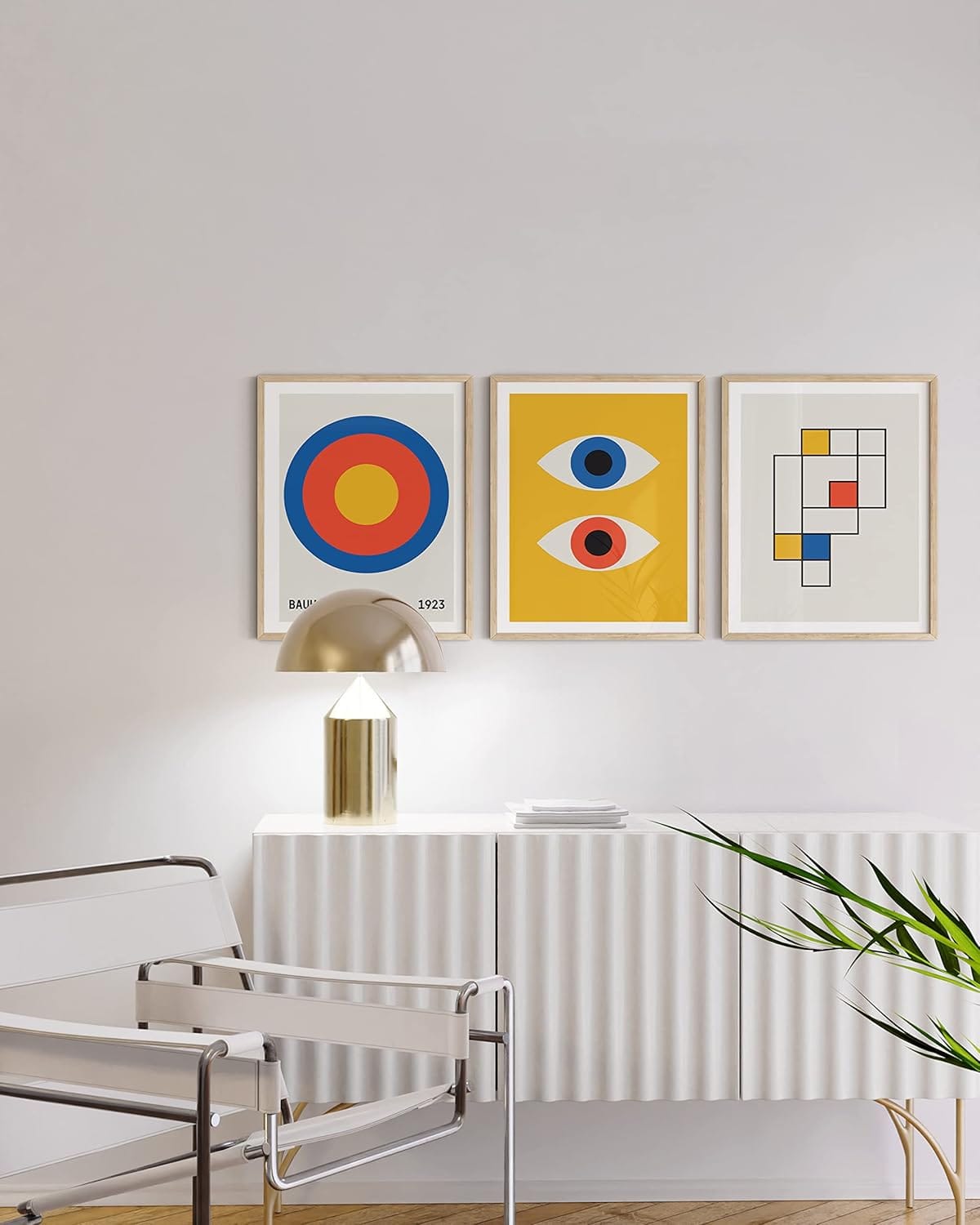
HAUS AND HUES Bauhaus Poster Art Set of 3
Pros:
- Heavy linen-textured paper; the weight reads in the room, not just on a spec sheet
- A set of three in one palette that ships as a coherent visual argument, not three unrelated images
- Original compositions, so there is no rights question to worry about
Cons:
- The blue and yellow palette is distinctive but limiting; it doesn’t work in every color scheme
- 12×16 is mid-sized; on a large wall these work better as a grouped trio than individually
Who it’s for: Someone building a Bauhaus-anchored room who wants the geometry without buying a museum piece.
National Gallery of Art Rothko Prints
Pros:
- Licensed, and made from paintings in the museum’s own collection
- Several sizes and a framed option, so you can match the print to the wall
- Priced like a poster, not like an edition
Cons:
- No print carries a Rothko at its real scale. The paintings were made to fill peripheral vision, and a 16×20 cannot.
- Selection is limited to the museum’s holdings
Who it’s for: Someone who wants the Rothko color-field register on a wall, with correct color and a clear conscience about where the money goes.
Why the print you choose is an interior design decision
The Bauhaus closed in 1933 under pressure from the Nazi government. Everything it produced, from the geometric forms and the primary palette to the sans-serif typography treated as a visual element, was an argument about what design was for. Walter Gropius founded the school in Weimar in 1919 with the premise that fine art and applied art were not separate disciplines. A Bauhaus poster in a room is not nostalgia. It’s that argument, still running.
Mark Rothko (1903–1970) worked the opposite register. His color-field paintings, built from thin washes of oil applied in layers, create atmospheric zones of color rather than formal objects. The scale matters: a Rothko at 11×14 reads differently than the same image at 36×48. The atmospheric effect depends on the color filling peripheral vision, not just central focus.
Period mixing works when you anchor with one movement and echo with one accent that shares a formal logic. Bauhaus geometry and mid-century graphic work share a palette logic: primary colors, geometric reduction. A Rothko and minimalist photography share a tonal register. What fails is three prints from three movements with no shared palette, no shared formal language, no reason to be in the same room. See Bauhaus Design Ideas and Mark Rothko Color Field for the movements themselves.
Frequently Asked Questions
What size art print works best for a modern living room?
For a living room, the standard guidance is that art should fill two-thirds to three-quarters of the wall width above furniture. In practice: a sofa that’s 84 inches wide wants a print or grouping between 56 and 63 inches across. A single statement print in the 24×36 range works for a dedicated wall. Gallery walls of 8×10 or 11×14 prints work above furniture where a single large piece would be overwhelming.
What is the difference between a licensed museum print and an unlicensed poster?
A licensed museum print, from the National Gallery of Art, MoMA or the Met, is produced under license from the rights holder, usually with archival inks on acid-free paper. An unlicensed poster of a copyrighted painting is printed without that permission and with no guaranteed paper or color standard. For Rothko and other artists still in copyright, the licensed print is the one that pays the artist’s estate, and the quality difference is usually visible at close range.
Are Bauhaus prints still relevant for contemporary interiors?
Yes, specifically because the Bauhaus visual language of geometric forms, primary colors and sans-serif typography shares formal logic with the dominant contemporary interior styles: Japandi, Scandinavian minimalism, and high-contrast modern. The Bauhaus wasn’t designing for 1919 rooms; it was designing objects with no period-specific ornament, which is why they haven’t aged the way Art Deco objects have.
How do I choose an abstract print that won’t look generic?
Two tests. First, does the print make a specific visual claim, a particular palette or a specific formal structure, or does it just gesture toward “abstract”? A color-field print with a defined palette is a design decision. A vague swirl of colors is not. Second, what’s the paper? Matte paper at 200 GSM or heavier is the threshold where a print starts to behave like an art object rather than a printed sheet.
Can you mix art prints from different movements in the same room?
Yes, with one condition: anchor with one movement as the room’s primary visual argument, then add one accent from a movement that shares either a palette logic or a formal register. Bauhaus geometry and mid-century graphic work go together because they share primary color reduction and geometric structure. A Rothko and minimalist photography go together because they share tonal restraint. Three movements with no shared logic compete rather than converse.
Where is the best place to buy art prints online?
Museum shops (the National Gallery of Art, MoMA, the Met) sell licensed prints of works in their collections, usually for $20 to $150. For original graphic work, independent print studios and design shops sell directly. Galleries handle original works and hand-pulled limited editions from about $500 up. For an artist still in copyright, check that the seller names the license before you buy.
For the broader context of this work, see the Design Legends hub, profiles of the designers and movements that shaped modern design. For a practical guide to buying and framing art prints, see how to buy art prints.

About Zoe Post
Zoe Post holds a BFA and a Master of Architecture from the School of the Art Institute of Chicago. She now works as a product marketing leader at an architectural product design firm, bringing hands-on industry perspective to everything she writes. At ADI she covers contemporary artists, textile and pattern design, and the design objects that sit at the boundary of art and function.