Minimalist modern interior design strips a room to its functional essentials — clean lines, a neutral palette, and materials that earn their place. The goal isn’t emptiness; it’s resolution. Every object serves a purpose, every surface has room to breathe. Done well, minimalist modern interior design turns constraint into a design argument.
Minimalism Is a Position, Not a Palette
Minimalism descends from two early-twentieth-century traditions that treated ornament as moral failure, not aesthetic preference. De Stijl (Netherlands, 1917) restricted its vocabulary to primary colors and the right angle. The Bauhaus (Weimar, 1919) declared that form follows function and that anything else was waste. Mies van der Rohe distilled both into a phrase borrowed from Robert Browning: less is more. John Pawson, who trained in Japan under furniture maker Shiro Kuramata in the late 1970s, refined the formulation further: minimalism isn’t about having nothing, it’s about having exactly what is needed. This article addresses warm modern minimalism, the Scandinavian-inflected practice of clean lines with natural materials, not the severity of Pawson or SANAA. That distinction matters for a room you actually live in.
Key Characteristics of Minimalist Interior Design
- Clean lines with no applied ornament
- Neutral palette grounded in whites, beiges, and warm stone tones
- Functional furniture chosen for resolved silhouette, not decorative detail
- Deliberate negative space treated as an active element, not leftover area
- Natural light as a primary material — planned, not supplemented
- Absence of visual clutter; every object must earn its place
- Limited decorative objects, each given room to read as a composition
Five Principles That Shape Minimalist Modern Interior Design
The Palette Is Not the Point, But It’s Where You Start
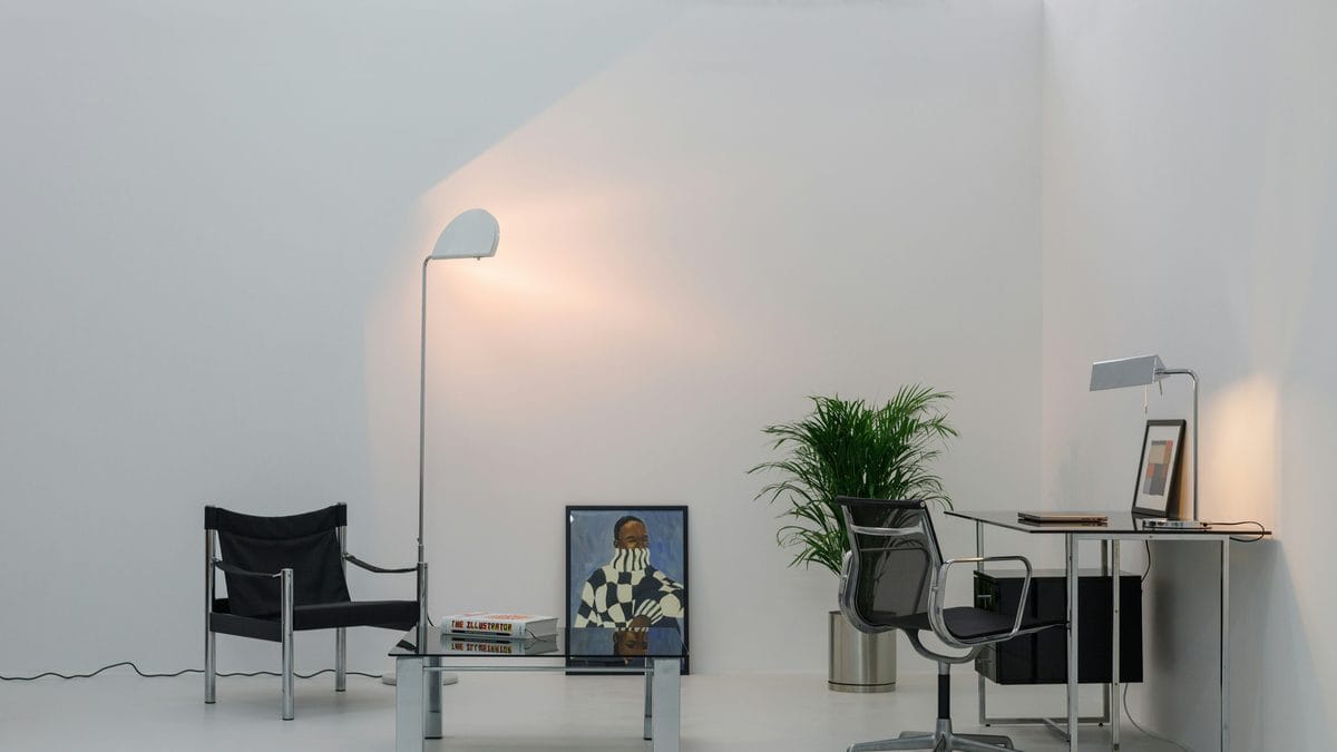
A neutral palette is the platform, not the argument. Whites, warm beiges, greiges, and stone tones establish the ground. The mistake is treating that palette as the design itself. Without variation in tone and undertone, the result is not calm; it is flat.
Undertones matter more in a minimal room precisely because there is nothing to distract from them. A warm-white wall reads as serene; a blue-white wall reads as clinical. The 60/30/10 rule gives structure to what could otherwise feel arbitrary: 60% dominant color, 30% secondary, 10% accent. In practice that means one warm white field, a secondary material in a contrasting texture at the same tonal value (raw oak, linen, poured concrete), and a single accent that holds without competing. When the room is quiet, every chair has to hold up as a silhouette. An accent chair with a resolved profile earns its position in a minimal room not as decoration but as a shape the room can accommodate.
The palette earns its resolution when each element has a reason to be the tone it is, not when the room is simply drained of color.
Furniture Quantity Is a Decision, Not a Default
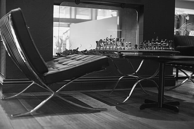
In a minimal room, the shape of a chair at ten feet is the chair. Detail is what you reach for when the silhouette isn’t working. Choose furniture whose silhouette is resolved at distance: Hans Wegner’s Wishbone Chair (1949) reads as a single confident line across a room. Most fast-furniture “minimal” pieces don’t hold that test.
The “one in, one out” rule is a design principle as much as a decluttering heuristic. Adding a piece requires asking what it displaces visually, not just physically. Scale matters as much as number: oversized furniture in a minimal room reads as sculptural; undersized furniture reads as tentative. Match scale to ceiling height and room proportion. If you are working with a compact floor plan, furniture designed for resolved proportion in small spaces applies the same principles at any scale.
Natural Light Is the Material You Forgot to Budget For
Minimalist rooms depend on light movement across surfaces. The way morning light rakes across a plaster wall is a design decision, not a bonus. It requires that the wall have texture worth illuminating and that nothing interrupts the path. Window treatment follows from that logic: either nothing (bare glass, where privacy allows) or something so resolved it disappears. Roller shades in the same tone as the wall. Roman shades that recess into a ceiling pocket.
For artificial light, recessed overhead grids are the wrong answer. They flatten a room and eliminate the shadow play that gives minimal interiors their depth. Use floor lamps with architectural presence, wall sconces that cast upward, pendant lights as singular objects. For lamp options that hold up as objects in a minimal interior, see our round-up of modern task and floor lighting.
Texture Is How Minimalism Avoids Being Cold
The most common failure in minimalist interiors is not too much stuff. It is too little material variation. A monochrome palette on smooth surfaces reads as a hospital waiting area, not a resolved composition.
Texture is what keeps a minimal room warm without adding visual noise. The materials that do this best carry surface character at the same tonal value as everything around them: linen, raw oak, poured concrete, fluted glass, hand-thrown ceramic, natural fiber rugs. Layering textures tonally creates depth through material contrast rather than color contrast. A linen sofa against a plaster wall against a sisal rug reads as warm because the surfaces are warm, not because anything was added. A natural fiber rug does double work: it defines the zone, absorbs sound, and introduces warmth that paint cannot. For objects with genuine material character, see our guide to minimal home products worth owning.
Editing Is the Skill, Not Decorating
The hardest part of minimalist styling is subtraction. The instinct is to add, a plant here, a throw there, until the room feels inhabited. But a room added-to until it feels inhabited is not a minimal room; it is a regular room that started with a neutral palette.
The 90/90 rule, developed by Joshua Fields Millburn and Ryan Nicodemus of The Minimalists, provides a practical test: have you used this object in the past 90 days? Will you use it in the next 90? If the answer to both is no, it does not belong in a minimal room. When displaying objects, the number is the argument. A single ceramic vessel on a shelf is a composition. Three objects are a collection. Seven objects are a problem that more editing will not solve.
The 3-5-7 rule of interior design holds that decorative objects should be grouped in odd numbers at varying heights to create visual rhythm. In a minimalist interior, apply the rule at its floor: groups of three, maximum, with deliberate negative space between them. The space between groups is not empty. It is the interval that lets each group read. Explore minimalist decorative objects and ceramic vessels as a starting point for what earns its position.
For the underlying formal logic — why these constraints produce better rooms, not just emptier ones — see our companion piece on the key principles of minimalist modern interior design.
Five Ways Minimalist Modern Interior Design Goes Wrong
The mistakes below account for most failed minimalist interiors. They share a root: treating minimalism as the absence of things rather than the resolution of a room.
1. Too much white without variation.
Uniform white on white produces the sensation of unfinished space, not resolved space. The palette needs purpose: warm whites against cooler whites, matte against satin, painted wall against unpainted plaster. Contrast without color is still contrast.
2. Confusing empty with resolved.
A room with nothing in it is not minimalist. It is a room that has not been decorated yet. Every object that survives the editing process should have earned its position. If you cannot explain why a specific object is where it is, it probably should not be there.
3. Buying furniture that looks minimal but is not structurally resolved.
Fast-furniture “minimalism” produces pieces with silhouettes that don’t hold up when there is nothing around them. The weak joint, the slightly wrong proportion, the detail that reads as afterthought: in a layered room, these disappear. In a minimal room, they are all you see.
4. Ignoring acoustics.
Hard surfaces, minimal textiles, and open floor plans create echo. A minimal room should feel calm; reverberation is the opposite of calm. Natural fiber rugs and linen curtains do acoustic work. This is not a decorative concession. It is why those materials appear in minimal rooms at all.
5. Treating lighting as an afterthought.
Overhead recessed grids eliminate shadow and flatten every surface. Interior design sources from Herzog’s Home to Apartment Therapy converge on this point. One floor lamp with architectural presence does more than twelve recessed cans. Lighting in a minimal interior requires the same deliberateness as furniture: single sources, directional intent, objects that read on their own.
Shop the Collection
Natural Fiber Area Rug
A jute or sisal rug defines the zone, introduces material warmth, and absorbs acoustic energy. Three functions from one object. That is minimalism in practice.
Explore natural fiber area rugs on Amazon
Minimalist Line Art Print Set
A three-piece set in neutral tones holds the wall without competing with the room. One of the few decorative moves minimalism permits outright.
Explore minimalist line art prints on Amazon
Some links on this page are affiliate links. See our affiliate disclosure.
Further Reading
Two books worth owning: one theoretical, one practical.
John Pawson, Minimum (Phaidon, 1996)
Not a how-to. A philosophical argument for reduction across architecture, objects, and landscape. Pawson’s photographs of empty rooms are more instructive than most decorating guides. Reading it changes what you see when you walk into a room.
Minimum on Amazon
Myquillyn Smith, Cozy Minimalist Home: More Style, Less Stuff (Zondervan, 2018)
Where Pawson is a theorist, Smith is a practitioner. This book is for the reader who actually has to furnish a room. It provides a decision framework without prescribing a style, which is exactly what a practical guide should do.
Cozy Minimalist Home on Amazon
Frequently Asked Questions
What is the difference between minimalist and modern interior design?
Modern interior design is a broad category defined by clean lines, functional furniture, and rejection of Victorian-era ornament. Minimalist interior design is a more specific position within that tradition. It goes further, treating every object as a decision that must be justified and negative space as an active element rather than a gap between furniture.
How do I make a minimalist room feel warm instead of cold?
The answer is texture, not color. Introduce materials that carry surface character at the same tonal value as the room: linen, raw oak, hand-thrown ceramic, natural fiber rugs. Warmth in a minimal interior comes from material variation. Adding more objects or switching to warmer paint misses the point; both add noise without adding resolution.
What colors work best in a minimalist modern interior?
Warm whites, greiges, and stone tones work consistently because they absorb and reflect light in ways that feel inhabited rather than institutional. Undertones matter most. The 60/30/10 rule: 60% dominant color, 30% secondary, 10% accent. It gives structure without requiring color complexity.
Is minimalist interior design expensive?
It does not have to be, but it is less forgiving of poor quality than layered design. In a busy room, a badly made chair disappears behind other objects. In a minimal room, it is visible. The investment case for minimalism is buying fewer things that hold up individually. Three pieces that work is less expensive than ten pieces reduced to three.
How do I start decorating a minimalist home from scratch?
Start with the floor and walls. Get the largest surfaces right before adding any furniture. Then add one anchor piece per room and live with it before adding the next. The editing process reveals which additions are necessary and which are habit. Apply the 90/90 rule to every object before it enters the room: past 90 days of use, next 90 days of use. What survives is your starting inventory.
About Joe Post
Joe Post holds an MFA in Art from California Institute of the Arts (CalArts) and has done additional graduate work at the School of the Art Institute of Chicago. He founded Art Design Ideas to write about design as cultural argument — the decisions, contradictions, and assumptions built into the objects we live with.