Bauhaus design for the home applies the principles of the German school founded by Walter Gropius in 1919: geometric form, honest materials, primary color accents on a neutral ground, and no surface decoration without structural purpose. The goal is a room where every object is there because it earns its place.
Bauhaus Was Built for the Apartment, Not the Manor House
The Bauhaus was not designed for people with money. Gropius founded the school on April 1, 1919 in Weimar, six months after World War I ended and Germany’s class structure had cracked open. The 1923 slogan, “Art and Technology: A New Unity,” was not aesthetic philosophy. It was a social program: good design should be manufacturable, affordable, and suited to the apartment, not the estate. As Frank Whitford established in Bauhaus (Thames & Hudson, 1984), the workshops were preoccupied with objects that could be produced cheaply enough for workers to own.
The school moved to Dessau in 1925, relocated to Berlin in 1932, and closed under Nazi pressure in 1933. Fourteen years. In that span it produced a body of work so well-fitted to urban apartment living that most of us still live with its consequences whether we know it or not.
Three principles define the Bauhaus approach to domestic space:
- Form follows function: every structural element of a piece should be reducible to its purpose; nothing that doesn’t carry weight or support a body belongs there
- Honest materials: steel looks like steel, glass like glass, wood like wood; disguising what something is made of defeats the object
- Primary colors on a neutral ground: white or grey walls, then one deliberate primary accent per room, used because of what that color does in the space, not for decoration
Characteristics of Bauhaus interior design, at a glance:
- Geometric forms throughout: sphere, cylinder, flat plane, cantilever
- Tubular steel furniture with visible welds and structural connections
- Materials left legible: no veneers hiding cheap substrates, no upholstery hiding structure
- White or neutral-toned walls and floors
- Primary color accents used once per zone, not scattered
- No ornament without structural justification
The “cold” critique of Bauhaus interiors is a critique of misapplication. The principles themselves produce rooms that are composed, legible, and proportioned for the places most of us actually live: the modern city apartment, human-scaled, without room to waste.
Four Principles for Bringing Bauhaus Design into Practice
The Bauhaus didn’t publish a decorating manual, but its workshops produced a set of principles clear enough to work from without one. Four of them do most of the work in a domestic space.
Form Follows Function — The Living Room
The living room is where Bauhaus furniture earns its argument and where it most visibly gets misapplied.
Marcel Breuer’s Wassily Chair, designed at Bauhaus Dessau in 1925–26 and originally called the B3, is the most-studied example of what this looks like in practice. The tubular steel frame was derived from bicycle handlebars. Breuer was thinking about industrial materials that could be bent, welded, and reproduced at scale. The leather slings do the work that stuffing, springs, and upholstery do in a conventional chair — they do it visibly, honestly, without pretending to be something else. Kandinsky saw an early prototype and admired it enough that Breuer eventually named the chair after him. It was the first piece of tubular steel furniture designed for industrial production.
The Casa Living Design Cesca Chair (Breuer, 1928) is the more versatile piece. Cantilever frame, cane seat, no back legs: structural honesty at human scale. It works as a side chair, a desk chair, an accent seat in a hallway. The Cesca was the first mass-produced tubular-steel caned chair; it was made in Italy for decades and still is. For sourcing across the full Bauhaus furniture range, the Bauhaus-inspired furniture guide covers it in detail.
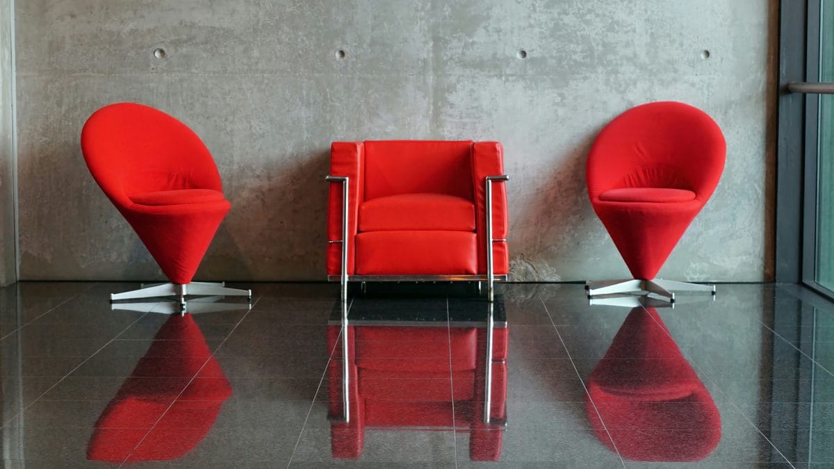
One note on composition: Bauhaus interiors are hierarchical, not democratic. One dominant piece per zone. Two Wassily chairs plus a Barcelona reproduction plus a Breuer side table in the same room is not Bauhaus. It’s a showroom. Pick one piece and let the room be organized around it.
One piece cannot carry the whole argument — but it can’t carry three other pieces either.
Honest Materials — Kitchen and Dining Room
The Bauhaus metalwork workshop produced objects in which the manufacturing process was left visible: welds shown, joints exposed. Steel looks like steel, glass like glass, wood like wood. The principle is not decorative. It is about refusing to disguise what something is made of.
In the kitchen, this translates directly: choose cookware and storage where the material is legible. Cast iron, glass storage jars, stainless steel. Not because these are fashionable, but because they don’t hide what they’re made of. A cast-iron skillet used for years is as honest a material object as anything the Bauhaus metalwork workshop produced.
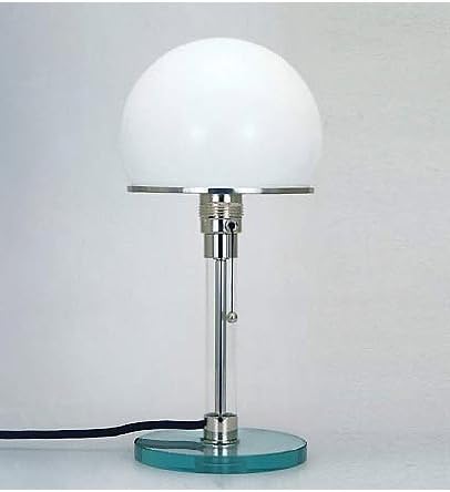
For lighting in this zone, Wilhelm Wagenfeld’s table lamp, designed in 1924 with Carl Jakob Jucker for the Bauhaus metalwork workshop, is the reference object. The glass base is fully transparent — you can see the electrical rod running through it, the fixture at the top, the wiring. The lamp shows you how it works. The TECNOLUMEN Wagenfeld WA 24 is the licensed original-specification reproduction. Expensive (expect $300 or more), but the only version that uses the glass base Wagenfeld actually specified. Every other reproduction substitutes materials in a way that defeats the point.
In the dining room, the Cesca chair works equally well as a dining chair, which is probably what Breuer had in mind. A dining table in solid wood with no veneer, or a glass-top table with visible steel legs, follows the same logic. The joint between glass and steel should not be hidden under a cap or cover. It should be there, doing its job, legible.
Primary Colors on Neutral Ground — Walls and Textiles
Bauhaus color theory was never about decoration. Johannes Itten taught it from 1919 to 1923 as a psychology of perception: how colors behave in relation to each other, what they do to the eye, how they move in space. Wassily Kandinsky’s “Point and Line to Plane” (1926) pushed this further. Yellow corresponds to the triangle, red to the square, blue to the circle. Color and form unified by psychological weight, not by preference.
The practical domestic application: neutral ground, one deliberate primary accent per room. White or off-white walls, grey floors or textiles, then once — a red chair, a yellow lamp, a blue throw. Not all three primaries in one room; that’s not Bauhaus color theory, it’s a Mondrian print. The primaries are not equal: yellow advances toward you, red holds its position, blue recedes. Use this directionally. A yellow accent in a long narrow room pulls the far wall closer. A blue accent pushes it back.
For textiles, Anni Albers joined the Bauhaus weaving workshop in 1922, and the workshop became one of the school’s most commercially productive. Her work is in the MoMA permanent collection. A Bauhaus-appropriate textile is geometrically structured and limited in palette. A black-and-white striped wool rug, a single-color linen throw. The weave structure should be visible, not hidden under pile.
Wall prints are the most accessible entry point into Bauhaus visual language without furniture cost. The Bauhaus Exhibition Poster Set of 6 reproduces original exhibition typography in Herbert Bayer’s geometric letterforms. At 11×14 and framed simply, it reads as seriously as anything more expensive.
Geometric Form — Lighting and Accessories
Bauhaus geometry is not ornamentation. It is structure made visible. The sphere on a cylinder, the flat plane on a bracket: these shapes are derived from what the object does, not from what the designer wanted it to look like.
In lighting: pendant lamps with visible bulbs and minimal shades in sphere or cylinder forms; floor lamps with adjustable steel arms. The shade should be the simplest geometric form that does the optical job. A sphere diffuses light. A cylinder directs it. If the shade is fluted, draped, or patterned, it is doing something other than Bauhaus geometry.
Accessories follow the same logic. A Bauhaus room does not accumulate objects for atmosphere. What’s on the shelf should be there because it’s used, or because it demonstrates the formal principle the room is organized around. One geometric ceramic bowl. One framed poster. The absence of objects is as deliberate as their presence.
Key elements checklist:
- Form follows function: no element present without structural justification
- Primary colors: one per zone, used for spatial effect, not decoration
- Geometric shapes: sphere, cylinder, cantilever, flat plane — no curves for softness
- Minimal ornamentation: every surface decoration must earn its place or go
Is IKEA Bauhaus? The Honest Answer
The question is fair, and it comes up often enough to deserve a direct answer rather than evasion.
IKEA was founded in Sweden in 1943. Its founding philosophy held that good design should be affordable and available to everyone, not just people with money, a position so close to the Bauhaus argument that the comparison is understandable. Both movements started from the same political argument: design is a social program, not a luxury.
But IKEA is Scandinavian democratic design, not Bauhaus proper. The distinction matters.
Where they overlap: flat-pack efficiency (the logic of industrial production carried through to the consumer), rejection of decorative excess, functional forms that prioritize use over display. These are genuine points of contact.
Where they diverge: IKEA uses wood veneers, soft curves, warm natural tones, and textile warmth as deliberate design choices. Bauhaus rejected all of these. The Bauhaus metalwork workshop would not have accepted a birch veneer over particle board. Material honesty was not a preference at the Bauhaus; it was a principle. IKEA softens the Scandinavian version of that principle with warmth and accessibility that the Bauhaus never sought.
The verdict: IKEA is democratic design in the tradition the Bauhaus helped establish, but it arrived through a different cultural tradition — Scandinavian democratic design — with a different formal vocabulary and a different set of material commitments.
If IKEA furniture is the most Bauhaus-adjacent thing in your apartment, that’s a starting point, not an endpoint.
What Gets Bauhaus Wrong at Home
The Wassily Chair does not make a room Bauhaus. A Wassily in a maximalist room full of pattern, decoration, and accumulated objects is a trophy, not a design commitment. The principle of removing decoration that serves no structural purpose has to operate across the whole room, not in a single chair. One piece cannot carry the whole argument.
Contemporary minimalism strips everything. Bauhaus does not. The color theory alone — primary accents, geometric textiles, exhibition prints — puts real objects in a Bauhaus room. The difference is that everything in a Bauhaus room has a reason. The red chair is red because of what that color does in the space, not because the room needed a pop of color. Minimalism says remove. Bauhaus says justify.
Minimalism removes. Bauhaus justifies.
Raw concrete walls, exposed ductwork, distressed metals: this is industrial loft aesthetics, which descends from Brutalism (1950s–60s), not from the Bauhaus. The Bauhaus was optimistic about industrial production. It wanted factories to make beautiful things affordable. It did not want the factory to be the room. The conflation of the two movements is common and almost always produces spaces that feel cold in the way Bauhaus spaces are accused of being cold, but the coldness is Brutalism’s, not Gropius’s.
Bauhaus furniture is also scaled for the apartment. The Barcelona Chair, designed by Mies van der Rohe and Lilly Reich in 1929 for the German Pavilion at the Barcelona International Exposition, is 29 inches wide. The Wassily is compact. These pieces work in normal-sized rooms because they were not designed for grand halls. Dropping a large sectional into a room and adding a single Bauhaus lamp does not create Bauhaus tension; it creates furniture contradiction.
For broader context on the designers and movements behind this work, the Design Legends hub covers the figures who shaped what Bauhaus design has become in the century since the school closed.
Shop the Collection
Three pieces that apply the principles directly, at three different price points.
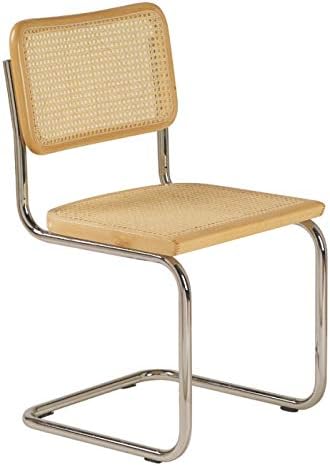
Casa Living Design Cesca Chair
Marcel Breuer’s 1928 cantilever — the most versatile piece in a Bauhaus-furnished room. Tubular steel frame, cane seat, no back legs. Structural honesty at human scale. Works as a side chair, desk chair, or accent seat. The first mass-produced tubular-steel caned chair.
TECNOLUMEN Wagenfeld WA 24
Wilhelm Wagenfeld’s 1924 table lamp. The glass base is fully transparent: you see the electrical rod, the fixture, the wiring. The lamp shows you how it works. This is the licensed original-specification reproduction — the only version that uses the glass base Wagenfeld actually specified.
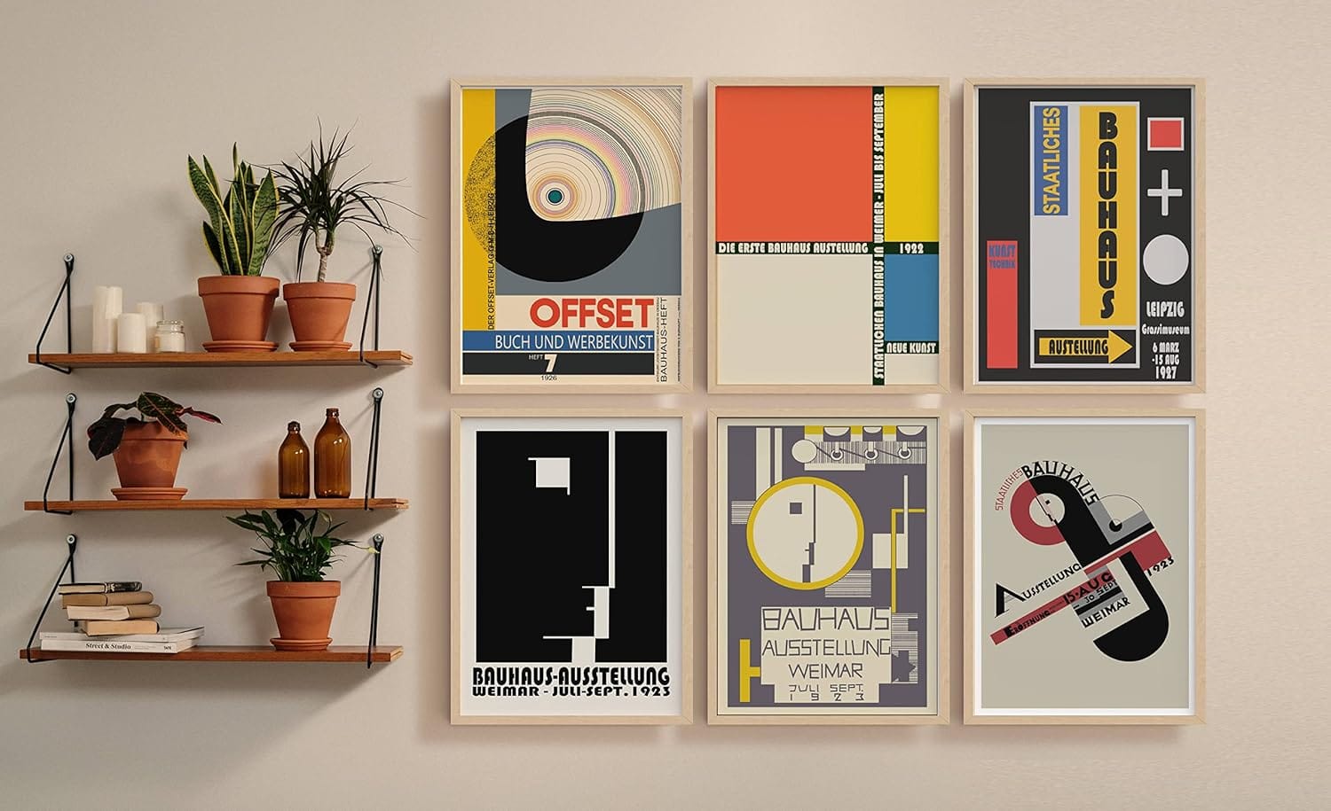
Bauhaus Exhibition Poster Set of 6
The most accessible entry point into Bauhaus visual language without furniture cost. Reproduces original exhibition typography in Herbert Bayer’s geometric letterforms. At 11×14 and framed simply, this reads as seriously as anything more expensive.
Further Reading
Two books worth owning if you want to understand what you’re looking at when you bring Bauhaus into your home.
Frank Whitford, Bauhaus (Thames & Hudson, 1984): Still the most readable single-volume English history of the school. It covers all workshops, all the principal figures, without assuming prior knowledge. The chapters on furniture and the metalwork workshop are directly useful.
Magdalena Droste, Bauhaus: 1919–1933 (Taschen): Droste worked at the Bauhaus-Archiv in Berlin; this is the most authoritative illustrated reference, produced in cooperation with the archive. Where Whitford gives you the argument, Droste gives you the images: more than 500 photographs of realized objects, interiors, and student work.
Frequently Asked Questions
What is Bauhaus style in home decor?
Bauhaus style in home decor applies the principles of the German school founded by Walter Gropius in 1919: geometric forms, honest materials (steel, glass, wood left legible), a neutral color ground with deliberate primary accents, and no decorative elements without structural function. It tends toward open space and objects that show how they work, proportioned for apartment living.
What are the three key features of Bauhaus design?
The three key features are: (1) form follows function — no element present without structural justification; (2) honest materials — steel, glass, and wood that look like what they are, without veneers or decorative cover; and (3) primary colors on a neutral ground — white or grey base with one deliberate primary accent per zone, used for its spatial effect.
Is IKEA considered Bauhaus?
IKEA shares Bauhaus’s democratic argument (good design, affordable, for everyone) but is Scandinavian democratic design, not Bauhaus proper. They overlap in rejecting ornament and prioritizing function. They diverge in material honesty: IKEA uses veneers and warm natural tones that Bauhaus would have rejected. IKEA is democratic design in the Bauhaus tradition, not its continuation.
What is the difference between Bauhaus and minimalist design?
Minimalism removes. Bauhaus justifies. A minimalist room may have no color and no objects; a Bauhaus room has a red chair because of what red does in that space, a geometric print because of how it activates the wall. Bauhaus also has a specific historical origin — a German school, 1919–1933, with documented principles — where minimalism is a later, broader aesthetic tendency without a single source.
How do I identify Bauhaus style in furniture and objects?
Look for: tubular steel with visible welds or structural connections; functional forms with no decorative veneer (the piece looks like what it does); flat white or neutral surfaces; primary color used once per zone rather than scattered; geometric prints with Herbert Bayer-style typography; pendant or table lamps in sphere or cylinder forms with no decorative shading. What Bauhaus objects do not have: fluting, carved ornament, hidden joins, or pattern applied for atmosphere.
Is Bauhaus style good for small apartments?
Yes, and not by accident. The Bauhaus was explicitly designed for urban, space-constrained living. The furniture (the Cesca chair, the Wassily Chair, the Wagenfeld lamp) is proportioned for apartments, not estates. The compositional principle — one dominant piece per zone, nothing decorative without structural purpose — also prevents a small space from reading as cluttered. The school’s entire social argument was built around the apartment.
About Joe Post
Joe Post holds an MFA in Art from California Institute of the Arts (CalArts) and has done additional graduate work at the School of the Art Institute of Chicago. He founded Art Design Ideas to write about design as cultural argument — the decisions, contradictions, and assumptions built into the objects we live with.