Ellsworth Kelly paintings are among the most uncompromising objects American art produced in the twentieth century. Kelly refused to compose: each work is a single color given a specific shape, placed in specific relation to a wall and a viewer. No arrangement, no gesture, no narrative. The painting is the thing itself.
What Kelly Was Arguing Against — and Why It Took Paris to See It
By the time Kelly arrived in Paris in 1948 on the G.I. Bill, he had already studied at Pratt Institute and the School of the Museum of Fine Arts, Boston. He was twenty-five. He enrolled at the École des Beaux-Arts and stayed in Paris until 1954. Within a year of arriving, he had abandoned figuration entirely. Not gradually or experimentally, but cleanly. The break came from looking at something specific: light dispersed across the surface of the Seine. He painted Seine (1950): black and white rectangles arranged by chance, not by compositional judgment. He was not interpreting the river. He was transferring what he actually saw.
Paris made this possible because it was outside the movement Kelly was arguing against. Abstract Expressionism dominated New York from roughly 1948 through the mid-1950s. Pollock, de Kooning, Kline: the painter’s gesture was the subject. The canvas was the field of the artist’s subjectivity. Kelly knew exactly what this was. He rejected it as a program. “By the time I got to New York I felt like I was already through with gesture,” he said. “I wanted something more subdued, less conscious. I didn’t want my personality in it.” That statement (made years after the fact) is not modesty. It is the thesis.
Between 1949 and 1951 Kelly developed four methods for removing himself from the act of composition: the transfer (copying the actual shape of a window or shadow directly onto canvas), chance operations (distributing colors by mathematical systems rather than aesthetic preference), the grid, and the monochrome panel. None of these is a style. Each is a procedure for evacuating the artist’s subjectivity from a decision the tradition had treated as the central act of painting. As Yve-Alain Bois notes in Ellsworth Kelly: Catalogue Raisonné of Paintings, Reliefs, and Sculpture, Vol. 1, 1940–1953 (Cahiers d’Art, 2015), written in direct collaboration with Kelly, each strategy was “motivated by something other than the arbitrary forces of the artist’s subjectivity.”
Kelly named his influences honestly: Jean Arp’s biomorphic abstraction, Matisse’s paper cutouts, and unexpectedly, John James Audubon. “When I was very young, I was interested in the hard shapes and he’s a fantastic artist,” Kelly explained. The Romanesque and Byzantine churches he visited throughout France shaped his thinking too, sharpening his interest in the relationship between painting, architecture, and the body standing in a specific space. His first solo show was at Galerie Arnaud, Paris, in 1951. He did not show in New York until Betty Parsons Gallery in 1956, five years after the work that mattered most had already been made.
A Painting Is Not a Picture of Something — It Is Something
The shaped canvas is where Kelly’s anti-compositional argument takes its sharpest form. Beginning in the late 1950s and accelerating through the 1960s, he freed color panels from the rectangle. The shape of the support became as much the subject as the color applied to it, not because the shape was expressive, but because the shape was specific. “I have worked to free shape from its ground, and then to work the shape so that it has a definite relationship to the space around it,” Kelly said. The wall is not the background. It is part of the work.
This is not the same argument what Rothko was doing with color at the same moment. Rothko’s color creates atmospheric depth. It suggests an interior, a psychological field, something that happens behind the surface of the painting. Kelly’s color has no depth. It is flat, declarative, present-tense. Red Blue Green (1963) does not ask you to enter it. It addresses you at the distance you’re standing. The distinction matters: Rothko makes color atmospheric and inward-facing. Kelly makes color a fact about the specific space you share with the work. These are opposite projects wearing similar clothes, and conflating them misreads both painters.
Kelly’s influence on the Minimalists (Donald Judd, Carl Andre, Richard Serra) is documented and real. But he preceded Minimalism by a decade and worked from entirely different premises. Minimalism as Judd theorized it was about the specific object in specific space and its literalness as a critique of illusionistic representation. Kelly’s anti-composition came not from a theoretical critique of representation but from direct observation of the world: shadows, windows, plants, light on water. The shaped canvas was not an argument about what art should not do. It was the result of looking very carefully at what things actually looked like and then insisting that the painting be that thing, not a picture of it. “The space I was interested in was not the surface of the painting,” Kelly said. “It was the space between you and the painting.”
His career received retrospective recognition at MoMA in 1973, a sculpture exhibition at the Whitney in 1982, and a full career retrospective at the Guggenheim in 1996, as documented in Kelly’s Museum of Modern Art collection records. He was awarded the Praemium Imperiale in 2000 (the highest international prize in the arts) and the National Medal of Arts in 2012. None of this changed what he made. The work from 1951 and the work from 2010 are in continuous argument with each other, and the argument is the same one: the thing itself is enough.
Five Works That Prove the Argument
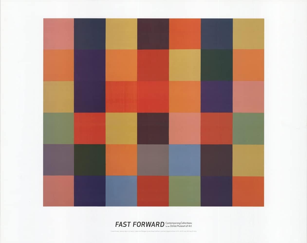
Colors for a Large Wall (1951, oil on linen, sixty-four joined panels, 94.5 × 94.5 inches, MoMA collection). Each of the sixty-four panels is a single color. The arrangement was derived from a chance collage study, Spectrum Colors Arranged by Chance, not from compositional judgment. Kelly considered it his Paris masterpiece. MoMA’s collection notes describe it as introducing his view of paintings as objects. The work is not a composition. It is sixty-four objects that happen to be adjacent, and the adjacency is a fact, not a decision.
Window, Museum of Modern Art, Paris (1949, oil on wood and canvas, two joined panels). Kelly was not interpreting a window. He was copying it: transferring the specific shape of an actual architectural element onto a support. The window is a ready-made composition; Kelly moved it. The painting contains no invention. That is the point.
Spectrum Colors Arranged by Chance III (1951, collage on paper). Kelly bought colored adhesive paper, cut it, and distributed eighteen colors according to mathematical systems devised for each work. The collage is the study; Colors for a Large Wall is the execution. Neither is composed by aesthetic preference. The series demonstrates what chance operations actually produce when applied seriously: not random-looking work, but work where the decision has been replaced by a procedure.
Red Blue Green (1963, oil on canvas, two joined panels, San Diego Museum of Art). Red occupies roughly half the field, blue the other half, placed against a green ground. The shapes derive from natural forms but carry no reference to them. What remains is color in specific proportion to another color, at a specific scale, in a specific room. No depth, no gesture, no center of interest. This is the declarative mode at its most direct.
Austin (2018, stone building, colored glass windows, marble panels, wood sculpture, Blanton Museum of Art, University of Texas at Austin). Kelly conceived this project (his only architectural work) in 2015 and gave the design to the Blanton before his death on December 27 of that year. The building is 2,715 square feet of stone. The colored glass windows cast pools of light onto the floor that are not decoration. They are the work. Austin extends the anti-compositional logic into three dimensions and lived experience: a viewer standing inside a colored field, the color inseparable from the space, the space inseparable from the light. It is the argument’s final and most complete statement.
Shop the Collection
Two prints worth owning, not because prints replace the experience of the originals, but because these two demonstrate the argument at a scale you can actually live with.
Ellsworth Kelly “Sanary” Art Print Poster (18.25″ × 21.5″): Sanary (1952) is one of Kelly’s cleaner early single-form works. It shows a dark shape on white and demonstrates the shaped-canvas argument without the print-reproduction flatness that hurts his more complex color works. The contrast survives reproduction better than most.
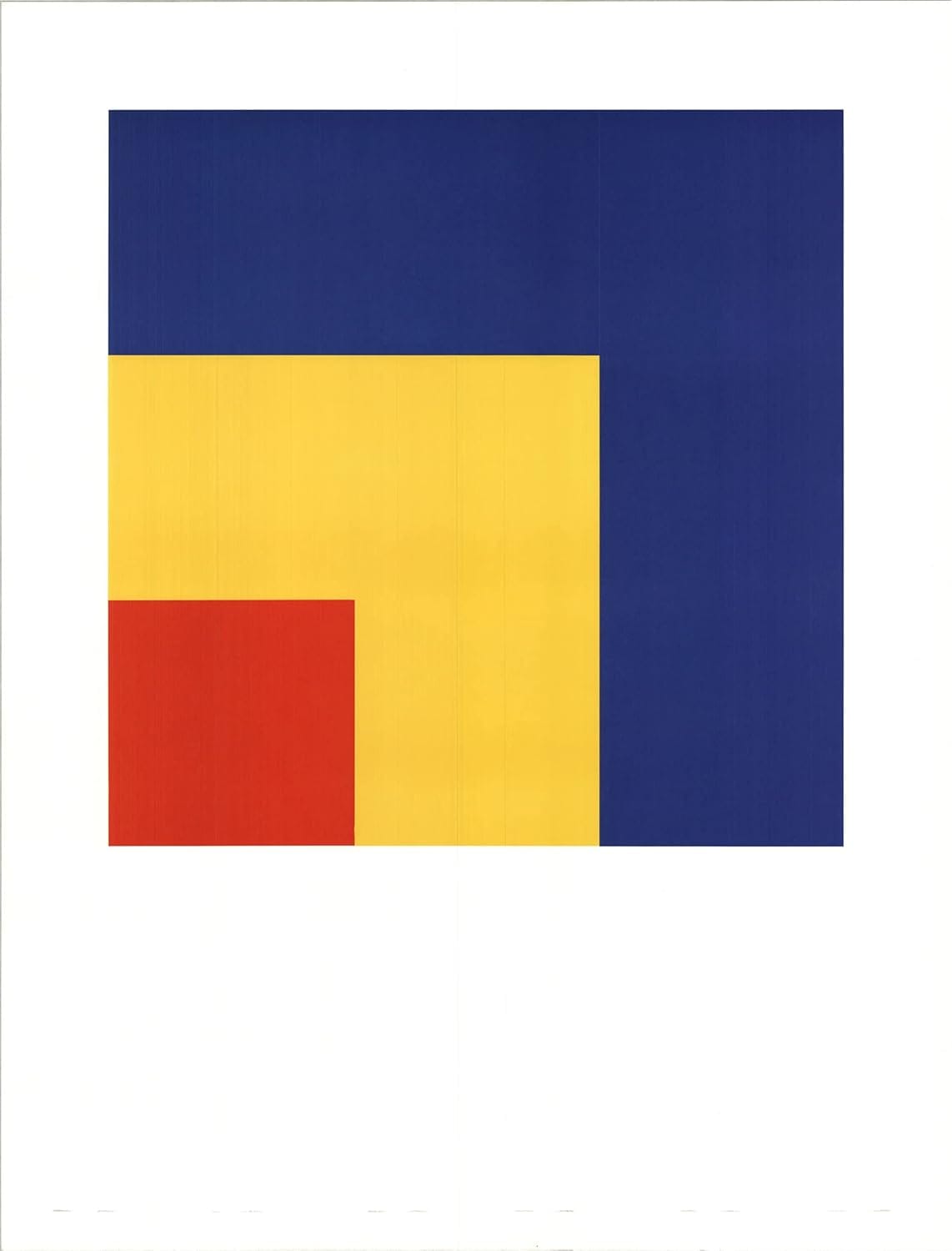
Ellsworth Kelly “Red, Yellow, Blue” Poster (33.5″ × 25.5″): The primary color palette is the clearest demonstration of Kelly’s thesis that color is the subject. There is no composition, no hierarchy. Three assertions of hue stand against a white field. At this scale, the work still holds its argument.
Further Reading
Two books approach the work from opposite ends: one is the authoritative scholarly account of where the argument was formed; the other is the most accessible entry point for readers who want to understand the logic through the prints rather than the wall-scale paintings.
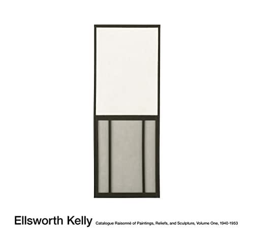
Yve-Alain Bois, Ellsworth Kelly: Catalogue Raisonné of Paintings, Reliefs, and Sculpture, Vol. 1, 1940–1953 (Cahiers d’Art, 2015): Bois wrote this in direct collaboration with Kelly. It is the authoritative account of the Paris years, with full documentation of every work and Bois’s critical texts situating each anti-compositional decision in the sequence it was actually made. If you want to understand why the argument developed the way it did, this is where to start.
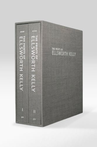
Richard H. Axsom, The Prints of Ellsworth Kelly: A Catalogue Raisonné (American Federation of Arts, 2012): Kelly’s printmaking practice spans more than sixty years and runs parallel to the paintings without being secondary to them. For a reader who wants to understand the logic of color and shape at a more accessible scale, the prints are the right entry point, and Axsom’s catalogue is the scholarly standard.
Frequently Asked Questions
What style is Ellsworth Kelly associated with?
Kelly is most often associated with Hard-Edge abstraction and Color Field painting, though both labels fit imperfectly. He preceded Minimalism and influenced it without belonging to it. His own term for his approach was anti-compositional: he worked to remove the artist’s subjective arrangement from the act of making, using chance operations, direct transfer from observed objects, and the monochrome panel. The shaped canvas is the clearest marker of his practice: a form of painting where the support itself carries as much meaning as the color on it.
Why did Ellsworth Kelly use shaped canvases?
The shaped canvas followed from his argument that a painting is an object, not a picture. If the painting is the thing itself (color given a specific shape), then the rectangle of the standard canvas is an arbitrary convention, not a necessity. By freeing the shape of the support from the rectangle, Kelly made the boundary of the work part of the work. The wall around it became active rather than neutral. As Kelly stated, his goal was for the shape to have “a definite relationship to the space around it,” which is not possible when the support’s own shape is invisible by convention.
How is Ellsworth Kelly different from Mark Rothko?
Both painters worked at large scale with color as subject, but their projects are opposite. Rothko’s color creates atmospheric depth: a psychological field the viewer is invited to enter or be absorbed by. The color is illusionistic in the sense that it suggests interiority, recession, emotional atmosphere. Kelly’s color is none of these things. It is flat, specific, declarative. It does not ask you to enter it. It addresses the viewer’s body in space rather than their psychic interior. Rothko is inward; Kelly is spatial. Treating them as variations on the same argument (both just “color painters”) misreads both.
Where can I see Ellsworth Kelly’s work in person?
Major holdings are at the Museum of Modern Art in New York, the San Diego Museum of Art, and the Blanton Museum of Art at the University of Texas at Austin, which holds Austin (2018), Kelly’s only architectural work: a dedicated stone building with colored glass windows open to visitors. The Guggenheim and the Whitney also hold significant works from different periods of his career.
What was Ellsworth Kelly’s last major work?
Austin (2018), a 2,715-square-foot stone building at the Blanton Museum of Art, University of Texas at Austin. Kelly conceived the project in 2015 and gave the design to the museum before his death on December 27, 2015. The building, with its colored glass windows casting pools of light, black-and-white marble panels, and a totemic wood sculpture, is the fullest extension of his anti-compositional argument into architecture and lived space. It opened in 2018 and functions as a site of contemplation rather than a conventional gallery.
About Joe Post
Joe Post holds an MFA in Art from California Institute of the Arts (CalArts) and has done additional graduate work at the School of the Art Institute of Chicago. He founded Art Design Ideas to write about design as cultural argument — the decisions, contradictions, and assumptions built into the objects we live with.